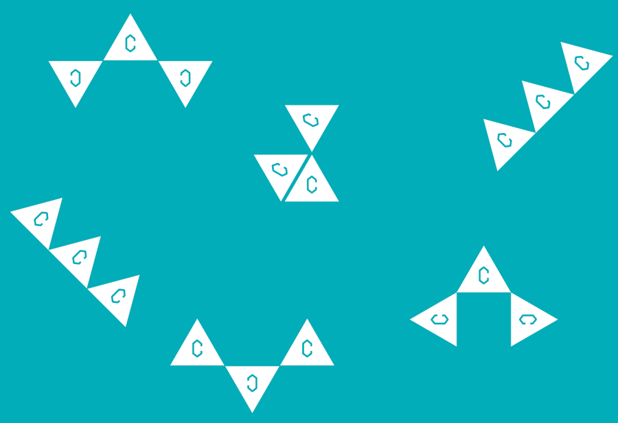
We've been developing identities for their year group, which will also be used as visual elements to work with when we design the publication and the website.
Our initial proposal consisted of three ideas. We named them Bob, Christian, and Martha.
Firstly, meet Bob.
He consists of three triangles. The placement of three triangle is pretty much up to the person who's using it, giving freedom and flexibility.


Next, meet Christian.
He is probably the best used as small icons. I also liked him because he can be drawn in a single stroke, he could be something that people use as a little signature. It would be lovely to see people drawing it a bit differently from one and another, giving it a character.


Now, meet Martha.
She came from an idea that the course consists of 38 students. Each word is written with lines connecting 38 points. For instance, the C for criticism bellow is written with 4 points.

From the feedbacks we received from CCC and through further discussion, we came up with a final exit symbol. We named it Nikita.
And here is Nikita.
She is sort of a child of Bob and Martha. Have flexibility of Bob but the C inside is replaced by Martha. We also set a color for Nikita, which has ambiguity between blue and green, that we thought suits this course. It is also a nice striking color that is eye-catching.


All of us from Graphic Design (JT, Duarte, and Franek) attended One Day Font workshop ran by Kate and Agostino. We wanted to make Martha fonts with different points, so that CCC can install the font and use Martha themselves.
For instance, this is Martha has 6 points per letter.


We as a group did sketches and idea generations together. Here's some of my sketches.


Then we sketched on computer, testing different ideas.


Phew. A lot of work and effort have been put into. JT, Duarte, and Franek are mega awesome to work with.
I'm usually not too keen on branding, but I like this system where it allows a lot of room to play. The proposed contents from CCC is sounding exciting too, so looking forward to more of this!
