Monday, April 30, 2012

A Week with Cura Website

Intense week of web design for Cura project. Working with Duarte intensively for the site and Franek and JT for overall Cura project.
You will see here that we pretty much had different ideas every single day for first half of the week.


Friday 20th April
Back from Morocco. Slept a bit and went to school. Welcomed by this lovely website. This is where it all began... at least for me. Thanks to Duarte for setting this up while I was away.

Saturday 21st April
A little break from web design. Cura group (ie Duarte, Franek, and JT) worked for poster design of Rathna's Wednesday lecture. We used her first slide as an inspiration and made our version of it.


The outcome poster looked like this:
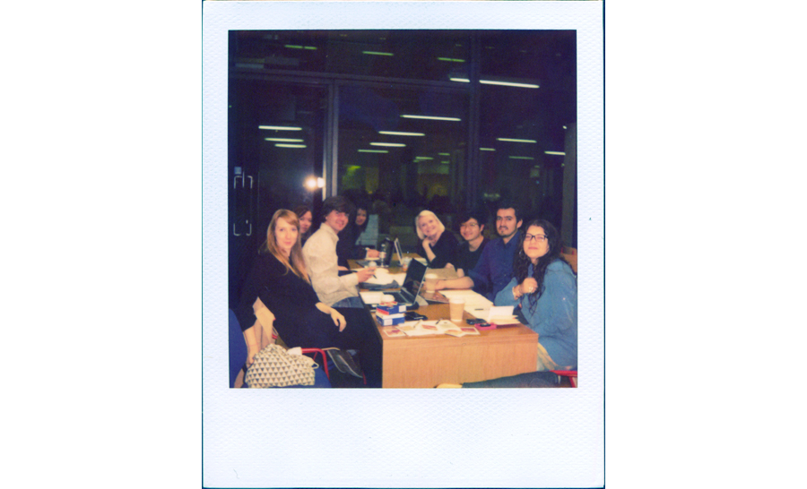
Photo of us with the poster even made it to her lecture slide :)


Sunday 22nd April
Incorporating CCC signature color we proposed, when we have done branding for them, on to the website. As well as use of the font we made for them.

Monday 23rd April
Because the direction of the website has changed from the initial idea and we are now only having only a  limited number of articles, we thought perhaps one page website is a good way forward. Readers may read things from top to bottom, if the site only has few articles. One page site is also quite close from the publication.
This is a design that has an accordion for each article. Reader can open and close articles, and can read the ones he wants to read.

Tuesday 24th April
The problem about one page site is that it is quite easy to get lost of where you are, which article you are reading. So, we figured some kind of subtle navigation that indicates which article you are at now would be helpful. Hence we ditched the lovely accordion we had the day before and went for this:

Wednesday 25th April
We had a turning point with a meeting with Rebecca. She is full of ideas and meetings with her always turn up in unexpected ideas and directions, which we always enjoy. With her advice, we  realize that our web design was lacking concept. There were rationale behind our choices, but the we can't deny that the design lacked strong concept. We were somewhat treating the brief as 'let's make those articles look nice and make them work' exercise. Striping down the brief to its core, going back to where we initially started the project at, really helped. And Rebecca successfully made us realize within such a short amount of time. Design of the site did not have the feel of progressiveness, when Cura was about progressive and expanding notion of curation.
Then started the idea of the world of Internet flowing behind the articles. Each articles to be hyperlinked excessively, and those linked sites act as backgrounds of the article, when hovered.
Some trouble of flash becoming on top of the article, which was fixed by Duarte later:
We were simultaneously finalizing the design for one page site-idea, getting the details defined. Just as a back-up plan.


Thursday 26th / Friday 27th April
Then came the defining details of the site. Including typography, linking sites, layouts, music playlist. Adding and fixing things.
Saturday 28th / Sunday 29th April
And finalizing everything. Making the look work with the print too.
When hovered on a link, the background changes:
And like these too:

It will be reviewed today. Hopefully to go online very soon!


紙とオンラインの連動、書籍のプロジェクト。デザイナーもエディターもみんな紙の方に気を取られ、ウェブはなんだか「おまけ」的な空気が漂っていたプロジェクト内の雰囲気。私と一緒にウェブデザインを担当していたDuarteとふたりで「このプロジェクトはあんまりコンセプチャルなことが出来なかったねー」なんて言っていた中、最後の2日で急展開を迎え、結局予定の日程を長引かせ完成したこのサイト。むしろ紙の存在感よりも勝っているとも勝手に自負してる、自慢の出来。
気になるデザインの方は、各記事に、無数のハイパーリンクが張ってあり、リンクにホバーすると、記事のバックグラウンドがリンク先のサイトに変わる、というもの。画像とかではなく、本当にそのリンク先のページがバックグラウンドになる。リンク=ネットの文法として捉え、ネットの得意とするハイパーリンクを全面にデザインの強みとして出し、紙の記事には出来ない、ネットならではの記事のデザイン。
つまり、「記事の後ろに流れるインターネットという世界」をそのまま見た目で表現した。
この書籍のテーマが、「キュレーションを大きな文脈で捉え、先進的なキュレーションを開拓していく」というものにふさわしい、前衛的なデザインになったと思う。

お金が絡んだり、全く違う職種の人たちとのコラボレーションだったり、締め切りを相手が全然守ってくれなかったり、印刷所とのやりとりだったり、スポンサーのいざこざだったり、デザイナー同士で全然違う価値観だったり、ありきたりながら、実際のプロジェクトって大変なんだなーと思った。でも、そんな中、一瞬は「ただの見栄えのいいサイト」になりそうだったものが、ちゃんとコンセプトがあって、面白いことが出来たサイトになったことは本当に良かった。毎日、まったく違うコンセプトを彷徨ったかいがある。

今日、関係者でのレビューがあるので、その後、プリントは印刷所に送られ、ウェブはオンラインに行く予定。早く、ちゃんと皆様にお届け出来ますように!

Tuesday, April 24, 2012

CCC Collaboration Continues


Set project number 2. Collaboration project with CCC continues!
Collaboration between different disciplines may sound great but is definitely harder to do. It may be frustrating for both sides to be using a lot of time for meetings and exchanging numerous emails, when time is precious and need a list of creative works to be done.

While I'd say other projects I have done this year are more challenging and thoughtful in terms of concepts, this project was challenging in terms of being realistic with every aspect. From managing time, working with a budget, working with a team that consists of non-designers, to coordinating with quite a number of people. We are a group of 9, with 5 from CCC and 4 from graphic design, but we also commissioned a lot of people from outside, as well as printers and was a good practice for non-design aspects of design process. Non-design side of design is as important in order to get any job done, but is usually not part of design process in CSM. I have avoided those administrative, coordinative side of design for all this time, this definitely was a good lesson and skill to be learnt.

Massive amounts of work to be done for the last few days of this project, but let's see what we can achieve within this time constraints.


CCCエディターの女子5人と、男子3人+私のデザイナー側のコラボレーション。そろそろ山場を迎えております。

「コラボレーション」とか、「異なった職種の共同作業」って、聞こえは良いけど、対等なコラボレーションって本当に難しい!
大人数やお金が絡むと、決定権や責任の確認で遅れが出て、メールやミーティングに、大切な創作の時間が取られて。理解し合えなかったり、政治的な駆け引きがあったり。

同じ大学でも、学部が違うだけで、こんなに大変なのに、まったく違う立場の人間同士がひとつのものを作り上げるのは、確実にもっと大変。でも、わたしも、数ヶ月後には、ひとりのデザイナーとして、全く違う立場の人たちと何かを作っているのでしょう。

ひとり、もしくはデザイナーだけのチームでやる方が、円滑に進むし、クリエイティブだとも思うのだけれど、今回のドラマチックな展開も、実はちょっと楽しい。物事はうまく行かない方が絶対楽しい。なんて、余裕な発言が出来るのも、素晴らしいデザインチームに恵まれたから。3人の男の子たちは、とても頼りになるし、仕事もビューティフル。ひとりじゃないから、苦しい状況も辛くない。

尊敬している先生に状況を相談した際、「こういう経験をして、一人前のデザイナーになるから、君たちはもう一人前のデザイナーだって宣言していいと思うよ」と言ってくれた。自分たちは、とてもプロフェッショナルに状況を対処していると思う。すべてが貴重な体験。ラストスパート走りきります。


Sunday, April 22, 2012

Yava for James Leevo

My Yava font was used for a German musician, James Leevo's album Home. Quite different feel from the implementation by vintage fashion Discode Vintage.
When I first put Yava font online, I wasn't expecting any of this to happen and it's quite exciting other creatives using my font.


Here is the trailer for his album Home:

Latest information can be found on James Leevo facebook page.

Tuesday, April 10, 2012

Relativity WIP


Made Relativity Helvetica font.
Available in two weights: 99% of speed of light, and 50% of speed of light.

Just another screenshots of the process.

First image is Helvetica against Helvetica Neue by the way. Not the Relativity Helvetica. I actually used Helvetica Neue.

Saturday, April 7, 2012

Website Re-design

My website got a re-design.


Some stuff that I wanted to do for a long time.
Especially 1) larger images, 2) less clicking more continuous scrolling. As well as, 3) responsive design for mobile and tablet devices, 4) creating some organization for photo section.

The first page is a lot of fun with animation GIFs when you hover. Meant to provide a bit of a random navigation for different pages in the site, but ended up quite fun.

Still extensive use of Yava font for the navigations but notice it got thicker strokes.


Here's the old design: