Wednesday, February 29, 2012

Yava for Discord Vintage

My font Yava has been used for the logo of an Australian vintage store Discord Vintage!


It's very nice of them to let me know about it, because this definitely got me excited! I know it's quite a hard typeface to use onscreen but they understood its limitations and I'm very happy with how they used Yava!
People using your font is quite a surprising experience. I'm happy and also secretly relieved to see something lovely coming out.
I'm especially liking their title for their Tumblr site.


Thank you Tee and Kym for featuring me on your newsletter and Tumblr too.
You can visit their Etsy site here for their lovely vintage clothes.

And you can download my Yava font for free from Da Font website. Number of downloads are 7000 and still counting....

Wednesday, February 22, 2012

From Text to Book Revised

I have finally completed The parts of a book project for from text to book brief. It was developing and changing nifty little things, like typographic details, making different versions and slowly improving the appearance and usability. While I was doing this, I realized if I do it well, it's something I would really like to use myself and that motivated me to make a good one. I am happy with the outcome so I'm actually planning on using it.

This is basically how it would look in action. You take a relevant section out, it's small doesn't take up too much desk space, and it lay open flat.

Sourcing the right paper was possibly one of the hardest challenges. Thankfully I came across this amazing paper shop in Tokyo while I was there during the winter holiday.

Walls are made up of drawers and shop keeper lady takes out your requested kinds of paper from those drawers. How cool is that?!
The shop has another room for cutting paper for you and deal with big sheets. Upstairs is a little gallery and when I went they had an exhibition about bookbinding and book covers. I can completely imagine few of paper lovers from CSM would absolutely love this place. And the price is much cheaper than it is in London, despite everything else in Tokyo being more expensive.
The shop stocks 2,700 kinds (!) of A4 paper and you can see and touch all these samples. At the back of the shop, they also stock 1,800 kinds of paper in large format, which they can cut for you. You can also order anything that is not in stock at the shop. In fact, their online store stocks 9,000 different kinds of paper. Seriously, we need this in London.

(above) This is how you request kinds of paper in the shop. Just like at Falkiners.

(bellow) The top row is the newly bought paper. The bottom row is the paper I previously used for my final crit. Notice the top row is much smoother and is more appropriate for this project.

Visit Website for TAKEO for more information about the store and its showroom.


見本帖本店に大興奮。
グラフィックデザイナーが紙の話をするのは、あまりにもステレオタイプ的で、馬鹿みたいなのはわかっているのだけれど、仕方ない。感情には逆らえないので、ひとりで大興奮。
私個人的には、色がとにかく大好きだから、グラデーションがあると無意味に感動しちゃう。だから、グラデーションを用いてた今回のプロジェクトは、そんな私が個人的に幸せになれるプロジェクトでした。番号をふらなくても、一目で順番がわかるようにとか、工夫は色々あるのだけれど、とりあえあず、ややこしい文章のものから、幸せで使いやすいものを作りたかった。出来上がりもハッピーな感じで!
見本帖本店さんは、色もそうだし、質感や、重さや、密度も、本当に色々な紙が揃っていて、グラフィックデザイナー以外の人も楽しめるはず。意味もなく、グラデーションで紙を買いたくなると思う。
見本帖本店ショールーム・ウェブサイト & Takeo Paper オンライン・サイト

Tuesday, February 21, 2012

Relativity Approval

So just how I wrote in my last post, I wasn't sure of my own reliability in the field of physics. I was afraid I was spreading a wrong understanding of physics concept, which obviously I would like to avoid. So, I got my best friend who's doing physics to check whether my understanding and work have any scientific flaw. It seems like I'm not getting anything wrong. Phew. Plus he said he liked what I did, which meant a lot to me.

Though he did mention that I should perhaps emphasize that the length contraction (of A4 paper) happens to the eyes of people in static frame of reference. To people who is in A4 paper, they are experiencing the time normally and to them, people on the earth would look like they are experiencing time fast.
Confusing? Yeah I know. I'll hopefully be able to explain better through my project.

Monday, February 20, 2012

Explaining Relativity part.2

I'm gonna be writing something that is outside of my usual expertise and I will admit in advance, I may be getting this wrong somewhere. If you happen to be a physics expert and spot any mistake, please let me know.
Meanwhile, I will explain what I understand and what I have done.

Theory of Relativity is kinda like the theory that says "if you are moving very fast, like close to speed of light fast, time goes slow and length gets shorter".
In physics term or as relativity treats them, space and time are closely related. The ratio that length and time changes relative to the velocity is simply inverse of each other with Lorentz Factor.
That is useful, because that means I can represent the time with length. It's basically the same ratio, so calculating the length is also about calculating the time. Time is intangible but length is, so it is nice to finally be able to give a form to time!

Bellow is a strip of paper that I brought in to the class to explain how time changes with different velocity.

Taking that further, I worked out different changes of length contraction with different velocity; from 1% of speed of light up until 100% of speed of light. I corresponded that with the width of A4 paper (210mm):
Let's take 16% of speed of light as an example. When an object is moving at 16% of speed of light, it looks 0.012% shorter from the frame of reference. So if A4 paper was flying at 16% of speed of light, in theory width will look like 207mm and not 210mm.
(The length would stay the same, and A4 paper is experiencing the time 1.013% slower.)
I used 99 sheets of paper, page numbered each, where each paper corresponds to each % of speed of light. i.e. page 16 corresponds to 16% of speed of light. There is no page 100 because at 100, the equation becomes 0. I don't really know what that suppose to mean, I'll figure it out sometime soon.

Yes, the front view is rather boring:

But it does look nice from the back (oh and it feels really good too!):

This version, that goes all the way up till 100% (or 99 pages) is the best representation of the concept of visualizing the Theory of Relativity, and the volume and all makes it quite poetic. But it doesn't have to go all the way up to 100% as the length get too small for a practical usage. It can be a 30 pages notebook for physicists/students, or a book that contains information about relativity, and it doesn't sacrifice all its practicality.
Ultimately it's just a book with different page sizes. And now that I've worked out the sizes for each page, I can reproduce it for whatever purpose.

A4 size is the standard paper size for graphic designers and normal usage of paper in general, so it makes sense to have it shrink and thus we can appreciate the change in sizes.
It's treats book as a medium with a relationship between a page and a sequence of pages.

In terms of binding, I was expecting it to be quite difficult but it turned out not too bad. I had to divide them into three different sections and it took a bit of time but the process was not complex and the end product looks nice. Thanks to bookbinding pro Douglas!

やりながら、「本=1ページの幅(サイズ)もしくは面積と、その蓄積(連続するページ)の関係性を持ったもの」、と考えれば、折線グラフって、本として表現出来るということに気づいた。応用し放題だなあ。でも、これ(相対性理論)は時間と長さについてだから、適切だと思う。
つまり、1つのページの幅か面積かが、折線グラフの点に当たり、その蓄積のボリュームが変化を表すという。本というメディアは時間軸を持っているという当たり前のことを改めて実感。でも、完成すると、ちょっと地形みたいでもある。
ひとつのものを、別のものに置き換えて、メタフォー探しの遊びをしてるみたい。

Sunday, February 19, 2012

Explaining Relativity

For Paulus' Timetable brief, I chose to do it on Theory of Relativity. Here is a little extract from the brief description Paulus has written:

What is time? Does time exist? Is time is a human construct?

Research existing general and specific systems of time keeping and notation. Understand the relations of various units and incremements. This will give you a better understanding of the subject matter and allow you to make a more informed choice of your field.  
Try to go into depth rather than skimming your theme superficially.

Since I was already working on the subject of time for my self-directed project, I stuck with it to go deeper. For self-directed, I was treating time from my own perspective and was interested in gaining a scientific perspective.
Theory of Relativity is an interesting one to tackle as it talks about how time is relative. i.e. time can go faster or slower depending on your frame of reference. It's completely counter-intuitive to our perception of time. Maybe neutrinos go faster than speed of light and Theory of Relativity is all false but I think it's still interesting to try and understand underlining idea behind Theory of Relativity.

My aim for this project is
  1. Try to understand Theory of Relativity (Time Dilation) myself.
  2. Explain the concept to others who are not familiar with the concept.
i.e. the main audience is not students or people who need to be solving the equations or apply it in any way. But highlight the concept and get people interested.

A conventional way of describing scientific concept it through diagrams. Here's some I found on Internet:
Yes they are from internet and are not at all sophisticated illustrations, but some are quite clear in terms of visualizing the concept.
Also, when explaining the concept of relativity, it may be clearer when explained by videos, even with animated GIFs:


I have also purchased the book Wonders of the Universe by Studio8 Design. For their beautiful beautiful scientific infographics by Nathalie Lees. A great reference:


Friday, February 17, 2012

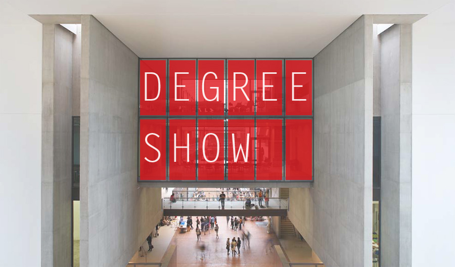
CSM Degree Show Identity part.2

Yes, we lost it. We lost the competition and I was sad. But life moves on! And the team aka Duarte, Clara, JT, and Alessia live strong. We made stuff that I never thought I could make, especially in such a short time.
(above) The working flip board unit, controlled by arduino. The wooden box that Clara made for it is so lovely.
Flip board with letters could have been used to promote events
(bellow) Tests of silk screened wood panels. Each letters were meant to be cut into 8 by 13 ratio grids too.

(bellow) map of the building, different invites, and red envelope, all following 8 by 13 ratio

(bellow) Navigation and way finding system for the screens around the college. Each pixel flips and is a digital version of flip board, without imitating the analogue expression. When the pixel 'flips', it makes very nice electronic popping sound.

Yes, we did pretty much all the executions in like two weeks! I suppose our ideas were challenging and perhaps risky, but we believed that we weren't proposing something that was unrealistic, and we thought we could make it happen. I'm happy that I got to work with those who were willing to take risks.
All of our design follow 8 by 13 ratio rectangles to create consistency and it suits with the architecture of the building, which is full of rectangles.
Damn, this was one sexy project, seriously. I love the various expressive outcomes that came out from quite a tight and appropriate theme of move and rectangular grids.
Oh and have I mentioned that my team was absolutely fabulous? Everyone was so hard working, that made all this possible...

コンピューターで制御可能なパタパタ表示機を作って、シルクスクリーンで部屋ごとの看板を作って、招待状やら、地図やらをデザインして、インタラクティブなお絵描きツールにもなるスクリーン用のナビゲーションプログラムを作って・・・。よくこれだけ、2週間ほどの期間でいろいろ作ったなあ。とにかく素晴らしいチームで、抜群なチームワークで、とにかく楽しかった。

残念ながら、コンペは負けてしまったので、結局この案が実現されることはないのはとても残念。週末返上で、毎日このチームでこのプロジェクトをしていたので、負けたとわかった直後3日間くらい、勉強する気が起きなくて、ぼーっとしてしまった。基本、勉強する気やら、やりたいことやらで溢れているのに、やる気が起きなくなっちゃうくらい、久しぶりにショックだった。普段、「これが欲しいー!」とか「勝ちたーい!」と思うことってほぼ全くないから、自分で自分が珍しかった。というわけで、このプロジェクトのせいで、大学の課題は遅れを取ってしまったのにも関わらず、直後3日間なにもしなかったから、更に色々遅れてしまい、いまはそのツケを払っている最中。笑。
まあ、このプロジェクト勝っていたら、勝っていたで、更に大変な作業量になることは見えていたので、負けたことで他のプロジェクトをその分磨けると思えば、良かったかなとも思うのだけれど。

でも、大学のスクリーン用にプログラミングしたプログラムは気に入ってもらえたので、それは卒展用ではなく、常設用に大学が買ってくれるらしい。それは楽しみ。

Saturday, February 11, 2012

Florence Wong

It's been a while now but one of my closest friends from school, Florence Wong drew my dog for me, which made me super happy.

She is one of my favorite illustrators, and she does a lot of work related with animals and foods. Her style is cute but many of works are quite surreal and sometimes a bit weird in closer speculation, which I love about her work.

Her recent series of postcards are so adorable.
You can visit her website or blog for more works.


可愛いのに、シュールで、よく見ると奇妙なイラストレーションのフローレンス・ウォンの作品。動物と食べ物の作品が多いのは、彼女の趣味そのまま。


Friday, February 10, 2012

Workshop with CCC


Some of us from graphic design are working on a project with students from Criticism, Communication and Curation (CCC) and we had an opportunity to do a workshop together, run by Joshua Trees and assisted by Rebecca Ross.
The day was intense mostly because it's something we were not used to doing. I think crits in CSM graphics lacks intensity, and while being laid back is not necessary a bad thing, I wished we had things like this workshop within our course program too.
It is a valuable experience to be able to participate from the very initial stage of conversations about the project, which funnily enough I realized is what I wrote my dissertation on. It is not a project where CCC brings writings and say "can you make website and publication using these?" but our inputs through dialogues can influence the shape of the publication, which is very exciting.

「批評、コミュニケーション、キューレーション(通称CCC)」という名の、セントマ内で唯一「ヴィジュアル」を作らない学部とのコラボレーション。グラフィックデザインからは、ウェブ担当が2人と、プリント(出版)担当が2人呼ばれ、この先数ヶ月かけて、一緒にプリントとウェブが連動する出版物を作り上げていく予定。もともと冬休み前に始まったものを、もっと具体的に詰めていくウォークショップを合同でしました。ちなみに私はウェブ担当。
「この文章や記事を使って、ウェブサイトと出版物を作ってね!」という、普通ならデザイナーとクライエントの役割がきっぱりと分かれている関係性ではなく、コラボレーションとして、企画の最初の時点から関われるのは、とても光栄なこと。まだテーマもうまく定まっていないCCC側との対話を重ねて、一緒にどういう方向性がいいのか模索していくのは、大変ではあるけれど、やりがいもある。

セントマのグラフィックのcrit(講評)では、クラスで順番に自分の作品発表して、それについて話し合うというのが通例で、1日中のcritでも、自分が標的になるのは自分の番が来た時だけ。大抵、テーブルを囲んでゆるーく話し合う感じ。それに対してこのウォークショップは1日中話続け、集中力を維持し続け、しかも自分の意見や自分の作品を発表するのではなく、相手の中に入っていくのが目的という未知続きの1日だった。セントマのグラフィックのゆるさも良いと思うけれど、集中とプレッシャーの中で、会話を重ねるのって、効率良いし、そこから生まれるものも大きいと思う。日々の生活にもっと集中力と緊張感が欲しい。

(above) Publications that people have brought in.
(bellow) Andrea and Caroline from CCC working hard.


(above) Lovely organized chaos.


Unexpectedly enough, this workshop made me think about graphic design practice. Especially with things that Joshua and Rebecca mentioned and by thinking about mutual aspects that CCC and graphic design have in common. Just as Joshua mentioned, even though people often say "graphic design for graphic designer is dangerous" but in fact there are many pieces of art that are about art itself, and sometimes it's ok for designers to look back and think about ourselves too.

Joshua and Rebecca also brought up the issue of authenticity and Rebecca mentioned that it is probably the most important value for her. I never really thought about authenticity but I thinking now, I think the importance of authenticity grew in me over the course of my three years in degree. Authenticity never was my concern in design practice, but I think it now is my most important value as well.


グラフィックの先生の1人が「CCC側から、authenticity(真正、本物、信頼出来る、確証できること)という言葉が出てこなかったのが面白いと思った。グラフィックデザインのcritでは常にauthenticityが話題にあがるから」と言っていて、別のグラフィックの先生も「authenticityは、私にとって最も重要な価値です」と言っていたのが印象的。私はauthenticよりも、honest(正直、誠実)という言葉を使うのだけれど、自分自身や、コンセプトに正直で、素直にいるということは、自分がデザインをする上で本当に大切で。デザインを計ることはとても難しいのだけれど、authenticかどうかというのは、私にとっても最も重要な基準かもしれないなあと気づいた。
CCC側に「グラフィックデザイナーはどういう風に考えているか」みたいなことを説明しながら、互いの共通点がいろいろ見えてきた訳だけれど、そのなかで、グラフィックデザインというものを考え直すことが出来たのは、いまの自分にとってとても有意義だった。