Showing posts with label lecture. Show all posts

Tuesday, March 5, 2013

How to Create A Font Using Your Own Handwriting

Back in December, I had an opportunity to speak at the Pecha Kucha Tokyo event #98. My thank you goes to Mr. Jean Snow for inviting me there.
What is Pecha Kucha? Here's extract from their website:
PechaKucha 20x20 is a simple presentation format where you show 20 images, each for 20 seconds. The images advance automatically and you talk along to the images.
PechaKucha Nights are informal and fun gatherings where creative people get together and share their ideas, works, thoughts, holiday snaps -- just about anything, really -- in the PechaKucha 20x20 format.
I've been to few events in London and they are trailer-like-fun way of sitting through multiple presentations. Though regular events in Tokyo has a nice vibe and is a great place to socialize. Presenters as well as audience have a good balance of English and Japanese speakers, and that's a bit of a bonus for people like me.

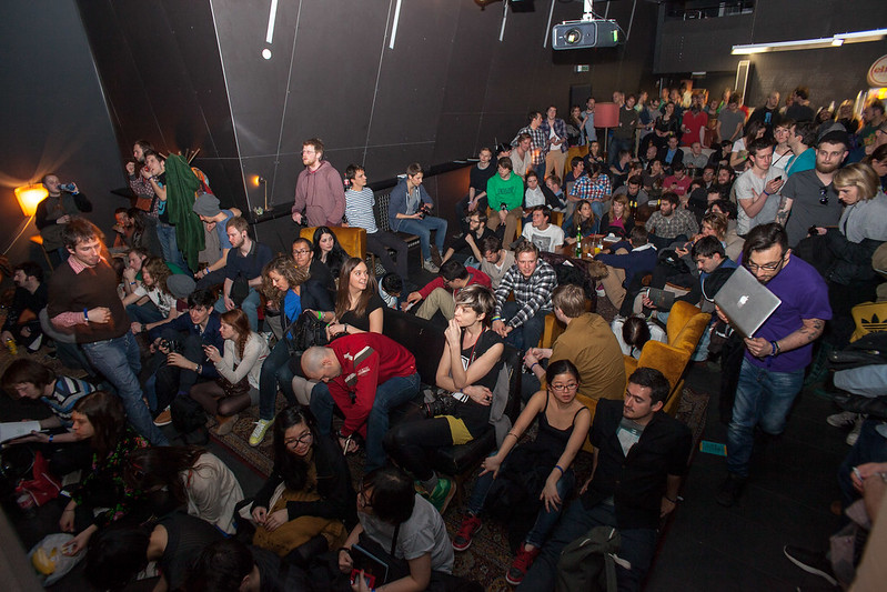
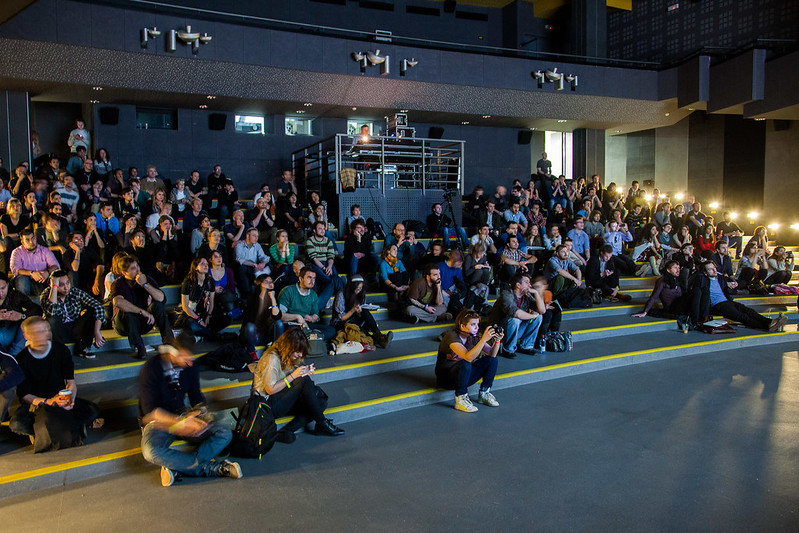
Here's some photos from the night. Photography by amazing Michael Holmes:


And here's the presentation I did on my Family Typeface project:


For one thing I sound so nervous and now I am too embarrassed to watch that video above. I mean, really. I wanted to try this informal way of presenting (the spirit of Pecha Kucha i.e. chit chat) but my topic went all over the place and it seems I'm still too rookie to do a presentation without a good practice beforehand. And no, drinking before the presentation didn't really help. That being said, It was fun nonetheless, and I particularly enjoyed informal chit chat afterwards with audience.

What I ultimately wanted to say in the presentation (and I wasn't so clear there) was that I've been thinking lately about aim-less / client-less / design-for-sake-of-design creation is great for your soul. I love problem-solving aspect of graphic design, but I think graphic designers can also be motivated like how illustrators or photographers do their self-initiated work.

I think, by nature, graphic designers are problem seeker. I've been using the term problem seeker after hearing Christopher Simmons using it because it feels spot on. At the pecha kucha presentation I used terms like problem solver and consultant, but problem seeker seem expresses what I really wanted to say.

You have problem seeking side to graphic design on one hand, but it just is so much fun to do work for the sake of having fun. That was one of my biggest finding from this idea-driven brief-less project, making handwritten typefaces. My then tutor Joshua Trees at Central Saint Martins really encouraged me on this when I was in college.

In any case, since my pecha kucha was just an introductory one, and I don't think it was clear enough to make people create their own fonts, I'm going to go over how to create your own handwritten font here on this blog. I'm sure there are many other different ways to do this, but it doesn't hurt to know how I do it.

In many ways, it may seem as a cheat-way of creating a typeface. I hope I don't upset any typographers...


How to create font using your own handwriting

What you need
TypeTool is the software that people usually wouldn't have. It's a font-generating software. It's got some flaws, but generally speaking it is easy to use and do what it needs to do. It's probably not a cheap purchase if you want to create one font, but it's worth buying if you are planning to make several fonts in the future. As far as I know, this is as cheap as the font-generating software goes.

I use CS5 of Illustrator, but nothing too complicated is being done here; we are just vectorizing the scanned paper. I am assuming any version should be able to do it...?


Step 1) Write down letters

Write out all the letters you'd like to have.
I print out a form (I might make it available online if there's any need for this) to fill in because I've done it for quite many people. Though essentially, all you have to do is write out all the letters you want to have on a piece of paper.
Then scan the paper into your computer.
The scan quality doesn't matter so much, as long as the contrast between written letters and paper are clear. Format doesn't really matter too, as long as it can be read in Adobe Illustrator.

Just as a reference I give you my scan settings:
  • resolution: 200dpi
  • color mode: grayscale
  • dimension: approx. 1600 × 2300
  • file format: JPEG


Step 2) Vectorize letters on Adobe Illustrator 

Open Adobe Illustrator, drag and drop the scanned image directly onto a new artboard.
Make sure the image is selected, then click Live Trace. This prepares to vectorize your image.


Then, set Preset to Simple Trace. And click Expand.
The beauty of Simple Trace is not only it vectorizes the image but also it deletes any 'white bit'. So you are left with clean black-only vectors. You can change Threshold to the value you prefer too.
You can manually delete or modify any bits you don't fancy.


Step 3) Copy and paste each letter into TypeTool

Open TypeTool. Each box corresponds to specific letter. Double clicking the box pops Glyph window (shown at the right window of the image bellow). Copy (Ctrl + C / Cmd + C) each letter from Adobe Illustrator then paste (Ctrl + V / Cmd + V) on to each Glyph window in TypeTool.

Tip1: When you are copying in Illustrator, you probably have to double click the letter first as the whole vector is probably grouped.
Tip2: If you can't see any letter even when you paste it into TypeTool, Zoom out the window. It's something that TypeTool does: it doesn't paste at the center of the screen.


Step 4) Sort out tracking

Let's work on the spaces between each letters.
Go to Window > New Metrics Window.
Select Text Mode (the symbol that looks like I ), type out letters.
Select Metrics Mode (the symbol that looks like | M | ), you can select and by dragging and the each end of the letter, you can adjust the space that particular letter has.


Step 5) Name your font

Go to File > Font Info.
Here, you can name your font. This name is how appears as the name of font when one installs the font into the computer.


Step 6) Generate font

Go to File > Generate Font.
Here you can generate font that's ready to use. OTF is recommended, but you can also choose other font formats like TTF.

CONGRATULATIONS you just created a font using your own handwriting!

(The example above was done using Hyunho's handwriting. Check out his website here.)


I'm not a pro of TypeTool or designing typeface in general, but if you have any question by all means, drop me an email to info@shihoyokoyama.com I'll try my best to answer questions...

Monday, March 26, 2012

Resonate Festival

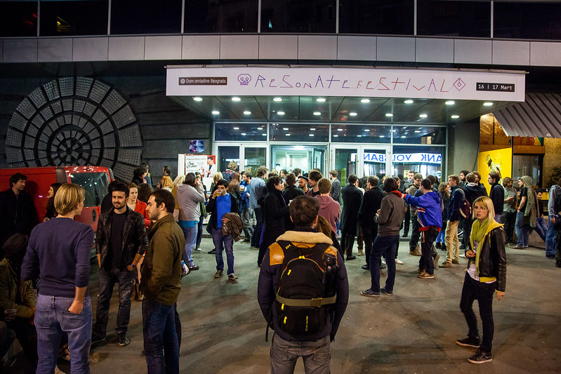
Here it is, Resonate festival.
Our friend Clara is exceptionally friendly, cheerful like a sunshine and she made loads of friends. So I too got to talk to strangers, which was fun.
Talks and conferences during the day, live music acts at night. Beers on sale throughout the day and night. Extremely sunny two days. It was a great festival indeed.

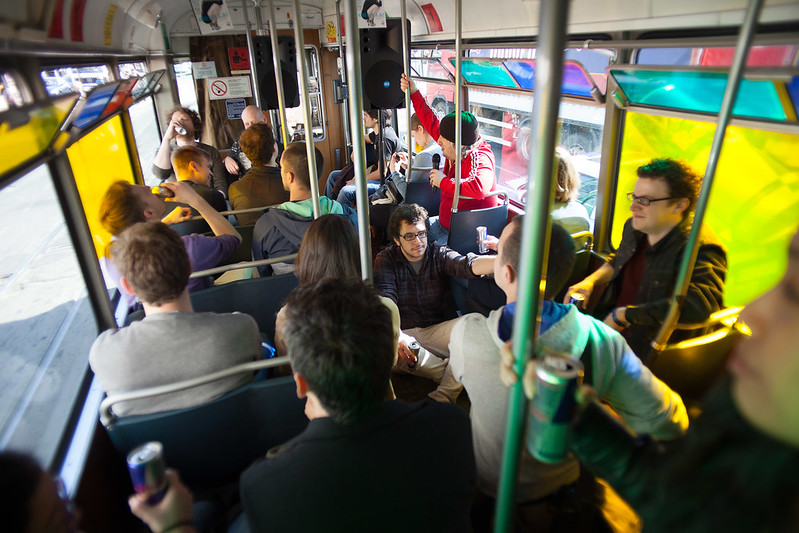
Our favorite event of all was a tram ride with Uros Djuric. Super informative and subjective tour of Belgrade. We listened to Serbian Punk music from 70s, it was so loud made pedestrians stare with surprise or some occasionally danced.

Here are the photos from Resonate Festival's Flickr:


レゾネート・フェスティバル、イン、ベオグレード。
フェスティバルというよりは、レクチャーで構成されたカンファレンス的な催しなのだけれど、同時進行で色々なイベントが行われていて、自分で好きなように予定を組んでハシゴして行くのは、フェス的な感覚。夜は、コンサート。前衛的な音楽なのに、観客ノリノリで拍手喝采で、驚いた。ベオグレードという辺鄙な土地で、最先端を行ったフェスでした。

レクチャーのクワリティーも高く、会場のムードも良かったのだけれど、一番楽しかったのは、トラムツアー。ファンキーなアーティストUros Djuricのガイドで、大音量でセルビア音楽(主にロックやニューウェーブ、時折パンク)を聴きながら、街を回った。

写真はResonate Festival's Flickrより:


Sunday, March 4, 2012

Mid-term Assessment and Berg Talk

Design & Interaction pathway (which is what I'm in) had to do a 5 minute pdf presentation for our mid-term assessment. Above are my slides. 39 slides to go through in 5 minutes sounds pretty crazy (7.69 seconds per slide!) but my timing went perfect. My strategy was to say somewhat one sentence (or one concept) per slide and that way timing became easier to predict and it was easy to memorize the entire script.
This assessment was all about looking forward rather than looking back. Situating Your Practice.

That leads me back to Berg talk we had last month.
The talk was given by Matt Jones and he mentioned just like how physical materials want to become certain forms, technology also wants to be in certain form. Sometimes it's weird to explain that, because people think technology is this thing that human have the power to manipulate in whatever ways, but it also has a voice. Just like a sculptor listens to the voice of wood or metal, same goes for technology too; we can listen to its voice when working with it.

I personally don't have much desire for self-expression nor I don't come up with an idea that I'm eager to create. I'm sort of more into obtaining a dialogue with a concept, and for instance Explaining Relativity project was all about listening to a material, and giving form to an abstract concept in a way that felt natural. That process is different from self-expression, answering client briefs, or solving problem. It's not that one is better than another or they have clear separate division, but I do think they all have different processes.
Ever since we worked on the Taschen for Tablets, we've been thinking about what feels natural for digital technology. I think listening to material is as exciting as listening to people. What Berg seems to be doing well is that even though they are tech-savvy company, they are being very friendly to technology. And by being friendly to technology, they are somehow making technology friendly to people too.

Here are some notes taken at the talk:

素材の声を聞いて造形する。「形を作る」というより、「形を見つける」。彫刻家に限った話ではない。例えば、テクノロジーでも、「テクノロジーがどんな形になりたがっているか」に耳を澄ますことで生まれる作品には、優しさがある。
そういうことをしている会社が、Berg。

私も、「こういうの作りたーい!」とか「すごいアイディアひらめいたー!」というよりは、データやらコンセプトやら素材やらと向き合って、「ふむふむ、どういう形になりたいのかい」とカウンセリングを繰り返す方が向いている気がする。デジタルもアナログも、素材として捉えて、どうやったら素材を活かせるかなと、向き合いながら対話するのが楽しい。素材と向き合うのは、クライエントの要望に沿うのとも、問題を解決するのとも、また違った楽しみ。

Monday, January 30, 2012

Three Weeks in

Three weeks has passed since the start of the term. So much and so little have happened, I don't know how to comprehend. This marks the end of January and I have about 6 months of life in London to go? INSANE.

Few selected highlights of those three weeks.

A lecture by Spanish illustrator/designer Javier Mariscal. Frankly, one of the most entertaining lectures I've ever been. His entire presentation was done in a series of movies, with music and animation, along with his live voice over (and singing). A lot of humour. Very Spanish. Made us all happy and laughed out loud. He sort of became a little legend among us.
I've always liked what he did for H&M in Barcelona, which I think I saw in Wallpaper* magazine. I have visited there specifically to see his design when I was in Barcelona.

More of his work can be seen at his Estudio Mariscal website.


Arduiono workshop with Angus:
Arduino is a kit that allows you to do physical computing easily and it's something I've never known before the start of this school year. I have never thought I'd be interested in such a thing (I chose graphic design because I was more interested in two dimensional objects in general over physical stuff), but this thing is so exciting. You can attach whole kinds of sensors for inputs, and it also can have various output modes.
Hardware and software are both open source and you can find more information at arduino.cc


Time/Speed self-set brief:
I've done series of experiments, timing myself as well as setting time limit to my activity. I've also done series of 'how much can I do in 3 hours' experiments. One of which was to record how far I can walk in 3 hours. I started in Old Street tube station, headed west, and ended up in West Ealing 3 hours later.
More information about the progress of my self-set project will be noted soon!


週7(!)で学校行って、大学の図書館でバイトして、日々の生活の中では大学関係の人としか会わないし、大学と家の往復の毎日という生粋の大学っ子。
毎日新しいことを知って、学んで、成長出来て、本当にそれは幸せなことで。でも大学というのは、守られた、小さな世界であることも事実なので、いつかは出なければいけないし、幸せな場所で幸せに完結するわけにもいかないので。4年間幸せに過ごしてきたのだから、そろそろまた苦しいのもいいよね。

自分は、「裕福な家庭で、外国でのびのびと育って、英語も幼いうちから喋れるラッキーな子」という印象を与えてしまうことが多いというのも、自覚していて。自分も、少し前までは「上辺で判断して、あたしの苦労も知らないでー」とぐれていたのだけれど、割と最近になって、自分は「努力」はしてきたかもしれないけれど、「苦労」は一切してきていないと気づいた。どんな境遇の人でも、努力はするべきだと思うけれど、苦労はしなくて済むのならしなくていいのだから、やはり自分は恵まれているなあと思います。親への一番の感謝はそこだと思う。なら、苦労しなくて済んだ分、努力したいです。

本当、自分に足りないものだらけで、毎日悔しいから、この際成長してみせるよー。

Sunday, October 23, 2011

Typo London 2011: Bitch, I Don't Know Your Life!!


All day long conference on the subject of typography.
It was overall a good day of learning (I've only attended the Saturday session), though I'm not sure the quality of those lectures have met the expectation that came with quite expensive tickets? There were many cases that the speaker didn't really talk about typography too.

My favorite speaker was probably Karin von Omteda. She's got a background in biology and she analyzes typefaces in a scientific way, but presents very fascinating visuals as outcomes.
Photo from her website's Type Diversity Poster page.

Apparently her work is in the current issue of Grafik magazine too.

By the way, "Bitch, I don't know your life!!" is apparently Chip Kidd's new mantra. I wasn't personally too found of his work, but he definitely had the funniest and most entertaining lecture of all. I don't usually read graphic novels, but I'd like to read his "Batman: Death by Design" once it's out.

Not just particularly about this conference but in general, it's quite interesting how I sometimes like what a designer (or an artist) says but not necessary like his work. Or I sometimes like his work but find him quite shallow in his speech. It's easy to be fooled that just because I liked a designer's lecture and found of what he's said, doesn't necessary mean that I find his design work amazing. Many times they go hand in hand, not necessary always.
It's maybe like, just because you get along as friends doesn't necessary mean you like each others' works, and vice versa?


3日間。朝の9時から夜の8時半まで。全日通しのチケットは780ポンド(約9万円・・・もちろん払ってません。運良く先生からタダでチケットが手に入ったので参加)。気合いの入ったタイポグラフィーのコンファレンス。でも、意外とタイポグラフィーに特化していなかったような・・・。

デザイナーのレクチャー(アイディア、思想)が好きということと、彼の作品が好きということは、まったくの別の話。思想が好きだと、作品も好きな気がしてしまうけれど、必ずしもそうではない。逆に、あまり考えが深くないデザイナーの作品にすごく惹かれてしまう場合もある。今回のコンファレンスは、作品がすごく好きなデザイナーのレクチャーが割とつまらなくて、すごく面白いレクチャーをしたデザイナーの作品を退屈だと感じるケースが多かった。

Thursday, July 7, 2011

Politics, Wikileaks and Assange

Photo from TechDigest


I went to Julian Assange, Slavoj Žižek and Amy Goodman's discussion on 2nd July. I do think I am not strongly political. I could even say I may have very limited interest and knowledge of politics. However, I do have belief in certain things and rights, and do own a vision for the future. That belief of mine, of course has a political side. That sounds fairly obvious but I think I only realized that through this discussion.

Some notes:

Assange: "Fox News actually aired more shooting and killing scenes than more liberal News shows like CNN"

Žižek: "Marx said honest conservatives are better than dishonest liberals. That's true because honest conservatives don't sell uplifting bullshits but dishonest liberals do."

China now prohibits the subject of time travel and AR on all media, including films, press, TV, news. It is to prevent people from imagining the possibility of another world.

Assange: "Bradley Manning was a young man of high moral character. When a man like that is put into such illegitimate situation, he becomes stronger, not weaker."
Žižek: "(About Manning) Sometimes in history there are ethical miracles. These people are our only hope today."

Assange: "We have the right to speak, right to know, right to communicate. We can have a civilized life, where we learn from each other and in less adverse way."
"It's important to enable everyone to contribute to the historical record of our civilization."
"A historical record that cannot be found isn't historical record at all."

Assange: "We are packed with 2000 people who actually paid £20 to come on a sunny Saturday afternoon. This wouldn't be possible 5 years ago."
"You are here because you think change is possible. And you're probably right."

Žižek: "Truth has to be contextualize. It's not just about telling the truth (and is what Wikileaks does)."

Assange: "Egypt's day-to-day life and technology there were just like it is in London. The idea that democracy is the one that manages and rules is ridiculous."
"Egypt had 20,000 political prisoners but never gained attention like Iraq. Press and writers write for their self-interest."

Assange: "Media try and portray that this voice is a outcast voice and is minority. The square played the role to make people realized that they were actually majority, by seeing the number in front of them. Just like what happened for Berlin wall."
"We are at the edge of such revolution. Bloggers don't just repeat the information that's already available but gives confirmation that there are also others that think the same way. It function as squares."

Assange: "Most of us have an instinct for justice."


It was an inspiring discussion to say the least. What a great way to start my 21st year.


The New Republicがロシアの哲学家「最も危ない思想家」と呼ぶSlavoj Žižek。New Yorks Timesらのメディアや政治家が敵対視して「情報テロリスト」とまで呼ばれる、Wikileaksの創始者で編集長ジュリアン・アサンジらのディスカッションに行って来た。
政治的なものから意識的にも無意識的にも離れたつもりでいて、自分は特別政治的な人間ではないと思っていても、自分の信念や価値観には、政治的な面も潜んでいるのだなと思った。

「正直な保守主義者は、正直じゃない自由主義者(リベラル)よりも良い。正直な保守主義者は人を景気付けるためだけの嘘や言い訳を言わないけれど、正直じゃないリベラルは平気で言う」というŽižekの指摘。アサンジも、Fox(アメリカの超保守的ニュースチャンネル)の方がCNNやリベラルとされるニュース番組よりも、実はちゃんと殺害や銃撃の場面を放送していたと言っていた。両者とも、「民主主義」や「自由」の名の下で行われる不正に対して警戒しているように思えた。彼らが戦っている相手は、もしかしたら保守党や右翼よりも、正義の振りをして嘘をつくリベラルなのかもしれない。

Žižekのアナロジーはなかなかユーモラスで可笑しいものが多かったのだけれど、その中でも良かったのはWikileaksを男女の浮気になぞえたもの。「男は女が浮気をしているのをなんとなく気づいていて、でも逆にそれがなんとなくセクシーだったりもしてそれで良かったのだけれど、あるとき浮気が本当に発覚する。最初からずっとわかっていたことなのだけれど、目の前に事実として突き出されると、怒ってちゃんと反応しなくてはいけなくなる。Wikileaksがしていることもそれと同じである。みんな政府やメディアが嘘ばかりついて信用出来ないということは既にわかっている。けれど、Wikileaksが具体的に嘘の内容を突き出すことによって、人々は怒りの感情や行動をちゃんと起こすことが出来るのである。」

今回の松本大臣の件にしろ、地震・原発にしろ、9・11にしろ、真実が知りたいし、人は本能的に正義や正当を求めるものだと思う。アサンジがTEDで、「今はどっちに転ぶが分からないぎりぎりのところで、だからこそ面白い」と言っていたけれど、その通りで。若いテクノロジー世代の人々は、縦のヒエラルキーではなく、ネットワーク的な人間同士の関わり方に慣れているし求めているはず・・・と思うけれどどうなるかはわからない。激動の時代を見届けるのが楽しみ。
ちなみにメディアはスルーしているけれど、日本はずっと前から原子力発電所の安全性に問題があると指摘がされていたという証拠がWikileaksで公表されている。
http://jp.wsj.com/Japan/node_233102


アサンジ本人は、もっとカリスマ的なオーラの人かと思ったら、静かにゆっくり、でもしっかり確かに話す人で、猫背気味で、いわゆる政治のリーダーとは根本的に違っていた。当たり前なのかもしれないけれど、すごく孤独そうな人だった。これほどの秘密を抱え込んで、ひとりで戦っているのだから、当たり前か。
今まで見た誰とも似ていないし、不思議で、魅力的で、強くて、恐くて、悲しそうな人だった。


Thursday, January 13, 2011

Adrian Shaughnessy Lecture : "Designer, Writer, Publisher & Educator"

Adrian Shaughnessy came to our school today and gave a lecture. He is a British designer, possibly most know for his book:At least this is how I know him. It's a great book, very clear and full of helpful advice. Plus I just love its title. I think every profession needs such books: "How to be a musician without losing your soul", "How to be a businessman without losing your soul"...

I find design lectures where designers talk purely about their works quite dull, since we could easily see their works on their website/books. They also all say the same thing along the lines of "being a designer's hard, it doesn't make money, but it's fun to do what you like". What I liked about Adrian's lecture was that he touched on what kind of changes this industry is undergoing and what is different/possible now.


Anyway, some points from the lecture:

1) Communication

Story of a guy from Google, who has online meetings with colleagues around the world all the time. He noticed that after meeting face to face, the whole relationship changes completely. Even super digital companies like Google believe in the power of meeting in person, and makes attempt to actually fly and meet people.
i.e. when applying for jobs, never just send pdf off. Go and see them in person. You may not get the job, but the discussion you have will be completely different when met face to face.
Design is a people business. i.e. communicational skill is important.


2) Change of Role

Designers now need to have much more sense of entrepreneurship.
Jobs today won't last long. Designers probably will be changing jobs every few years.
Nowadays it's possible to start independent business (in Adrian's case to start a publisher) to be in control of your creation.
You can just use blog/twitter and people all over the world knows about your work. Instead of paying tons of money to magazine to get an ad on.
Designers are more interested in social issues. Moving on from 'making pretty layouts'.


Apparently there is a radio show every Thursdays where Adrian interviews graphic designers. It's called "Graphic Design on the Radio" and you can listen to the archives here.
http://www.shaughnessyworks.com/