Thursday, June 30, 2011

RCA Show 2011

Being the best Art and Design postgraduate school in UK, it's not surprising that Royal College of Art had a very strong show this year.
The show was held in their school, but remained to look very professional (ones in our school looked far less professional when compared to ones in spacious RCA), and at the same time it provided a rare opportunity to see inside their buildings.
If we could use spaces like they had in RCA, doing shows inside a school is very exciting and another reason to be looking forward to Kings Cross site. Now I'm finally understanding why people are saying doing a show in Kings Cross will be good for publicity. Of course the public want to see the new CSM!

Anyway photos from RCA Show Kensington. Looking nice, no?


I found Communication Design rather weak, and much preferred MA Communication Design from CSM. Though I will note that RCA has much smaller class, where as CSM is overwhelmingly massive. I loved the prints in RCA shop but I don't think they were on display and was disappointing.
The architecture bit was quite fantastical in terms of display, and very strong drawings.
It's a bit of a shame that you can't see any RCA connection with Imperial College, which is literally just next door.
I didn't go to Goldsmiths but in comparison with CSM and Slade, RCA was the strongest in Fine Art.

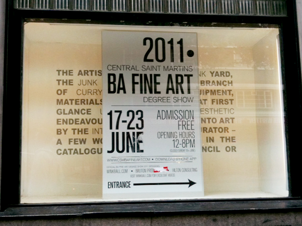
The show ends this week. I highly recommend to go visit.


Some notes from Show Battersea and my very precise holiday plan:


英国が誇る、世界最高峰のアート・デザインの大学院、ロイヤル・カレッジ・オブ・アート。その卒展を観に行ったら、かなり面白かったので、せっかくだからと2カ所、計5つの建物すべて回ってみた。
RCAの作品というのは、見た目の完成度も高く、アイディアも練られている。デザインの校舎の展示のキュレーションはとてもすっきりしていて、大学構内とは思えないプロフェッショナルな空間の見せ方。展示に合わせてテーブルの高さも変えていて、作品も見やすかった。ファインアートの方も、かなり広々とした空間で、美術館にいるみたい。

車のデザイン専門の学科まであった。車にあまり興味がないから、スルーしたのだけれど、今考えると、すごい精度の模型であれを作ったのはすごいなー。
きっと良いコンセプトなのだろうけれど、「環境にいいです」的な外見が嫌い。シャープでかっこいいスポーツカー的デザインで、見るからに環境に悪そうなのに実はエコカーで環境にいいです、みたいな風になんでならないのだろう。何も知らないから、スポーツカーに中身だけ電気自動車のエンジン積めばいいじゃん!と思うのだけれど、配線やフォームに色々な事情があるんだろうなあ。どうなってるのか興味があるかも。

Slade、セントマ、RCAと見て来て、アートよりもデザインの方が元気な印象を受けたけれど、それは自分がデザインをやっているバイアスがかかっているからなのか。フリーズにしろ、卒展にしろ、最近のアートはなんとなく「デザイン的」なものが多い。もうちょっと、自由でアーティストにしか出来ないようなことをやってほしいなと思うのは、デザイナーの我が侭?

Tuesday, June 28, 2011

Holland, Horizon, Perpendicularity and Me

This is where I grew up:
This was the scenery behind my house in Amstelveen. It looks like middle of nowhere but it really wasn't. The whole of Holland pretty much looks like this.

Holland is flat. My mom says when she moved to Holland for the first time, she couldn't bare that boring flat scenery that seem to keep on repeating itself. But that's where I grew up. The surprise I got when I first moved to London was that there're actually hills and slopes. I found slopes to be nuisance. They make you tired.

Holland is about horizon and perpendicularity. Hence De Stijl:
Photo from Dwell

If I look at the photos I take, a lot are horizontal and perpendicular to the edges of the frame. I secretly believe my love for horizon and perpendicularity is because of the Dutch flat scenery.


海や、砂漠や、ビーチや、草原や、水平線や、地平線が大好き。自然の風景は「何もない」に近いものが好き。それは育ったオランダの影響だと思う。オランダはどこまで行っても、平地。だからか、山とか丘とか滝のような豊かな自然に興味はない。ロンドンに引っ越して来た当時は、「坂って邪魔だなあ」と本気で思っていた。

私の撮る写真は、水平で垂直なものが本当に多い。これもきっと、育ったオランダの影響。水平で垂直の写真というのは、悪く言えば動きがなくてつまらないけれど、良く言えばシンプルでスッキリしている。

自分のデザインも、本当に水平と垂直だらけ。真っすぐな線と平らな面ばかりで、グリッド的。ファッションにしろ、建築にしろ、フォーム自体は出来る限りシンプルで、その分色や質感で遊んでいるものを好きになる傾向があるような。

オランダのあの水平さは、アーティストよりもデザイナーを生む景色かも。

Monday, June 27, 2011

Stefan Segmeister and the Notion of Branding

I was talking to a friend today about the difference between advertising and branding. He said advertising seem to be applied to a product and branding is more about the larger idea.

I grew to value less of advertising but I still have never disliked it. I just always thought it's not my thing, simply because it's seemed to be more about an idea, which is a very initial state of design process, and I'm rather interested in the whole process of making, which design allows me to do.

I have never been a big fan of a graphic designer Stefan Segmeister. I knew him from two of his works; one work was where he scratched his own skin to have writings on, and the other was where he photographed himself before and after of eating a whole lot of junk food. To be honest I loved both of the works but they both gave me an impression that he's a strange do-it-your-self typography guy.
Photo from Culture of Design

Photo from HITSPAPER

I recently came across his talks on Design Observer podcast and series of TED talks, which I actually loved. I loved what he said about Bali; especially since I've been there recently and I agreed with a lot of the things he's mentioned, but what I loved the most was his branding work of Casa de Musica in Porto.
Photo from Flux

The idea is simple. The logo is basically the shape of the architecture. You put an image into this specially made software, it picks up the colors used in the image, and put those colors onto the logo, making every logo different colors. I love this in so many levels namely:
1) Colors of the logo will always match with the image. No logo not working with image nonsense. Solves the problem that logos always had.
2) Great example of how technology aids an idea, without technology being the center of attention.
3) Such a good interpretation of Rem Koolhaas' architecture. Koolhaas' architecture are 3D versions of graphic design and it's just so relevant how Segmeister used it as a logo.

I really, still cannot get over how much I love this work by Segmeister. Never got as excited about branding as I have with this work, and I hope there are more of such in the world for me to discover.


今日、友達と広告とブランディングの違いについて話した。彼は「広告とはある特定の商品について行われるものだけれど、ブランディングというのはもっと大きなイメージについてであって、自分は広告には興味はないけれど、ブランディングは好き」と言っていた。
当たり前かもしれないけれど、デザインの学生が集まれば、自然とデザインの話をする。デザイナー同士のメールの内容は大抵デザイン関連で、今日のようにパーティーに行けば、酔っぱらいながらデザインについて議論する。同じ興味を共有する人が集まるわけだから、美大に入ったらそういう議論って自然と起こると思っていたのだけれど、大学生活の半分が過ぎてようやく、そういう態勢が出来上がった。たかが議論、たかが情報交換だけれど、それらはお互いに対する信頼や尊敬があってようやく成り立つ。

Photo from Flux

広告やブランディングという職業に対してあまり興味はないのだけれど、オーストリア生まれニューヨーク在住グラフィックデザイナーStefan Segmeisterのポルトにある音楽ホールのブランディングがとても好きで、「ああ、ブランディングというのはここまで面白く出来るものなんだ」と最近になって今更実感。
アイディア自体はとてもシンプルで、ロゴは音楽ホールの建築をそのまま取った立体的なキューブ。写真をソフトに入れると、自動的にロゴに試用する色を選んでくれる。これのどこが好きかというと、
1.ロゴと写真の色が常にマッチするから、ロゴを作成・試用することで常に問題だった「ロゴと写真の色が合わないよー!」ということが起こらない
2.テクノロジーに重点が置かれたデザインではなく、あくまでテクノロジーがアイディアを助けた良い例。
3.ホールを設計したレム・クールハースの建築の抜群な解釈。クールハースの建築は立体版グラフィックデザインみたいなもので、それをそのままロゴに持って来るというのは、とにかく適切。

ブランディングでここまでワクワク出来るなら、広告やブランドっていうのも面白いなーとこの作品を通じて思い直した。

Sunday, June 26, 2011

The Fashion Industry

Fine Art industry work very different from Design industry. Fine Art industry has sets of special rules. It's like a game. A bit like a sport. Design is more commercial, so it's less rule-driven industry but is a lot of the times business-driven. In any case, the strangest industry to me is the one of Fashion. They all follow the same schedule; there're deadlines 6 times a year. It's quite incredible how designers can remain to be creative in such tight routine of timelines and under so much pressure. I also think such formation of the industry is not suited for every designer.

Few weeks ago, I went to Mary Katrantzou's talk at ICA. She was a very enthusiastic, very lovely and happy woman who laughed a lot. Take Marc Jacobs, take Paul Smith, there are actually so many very cheerful happy famous designers in fashion industry. I wonder why all those fashion kids on the street (ones queuing for sample sale for example) usually look so bitchy.
Mary Katrantzou's AW11 collection was absolutely gorgeous by the way.
Photos from Style.com


アート業界とデザイン業界というのは、まったくもって異なっている。アート業界には、様々なルールがあって、少しゲームやスポーツみたい。デザイン業界は逆に、ビジネスに操られている部分があると思う。なににせよ、一番おかしな業界はファッション業界。年6回の決まった締め切りがあって、業界が一緒に動く。そんなタイトなスケジュールやプレッシャーの中、クリエイティブで居続けるデザイナーはすごいと思うけれど、そのような業界の在り方がすべてのデザイナーに向いている訳ではないとも思う。

Friday, June 24, 2011

Central Saint Martins and the Future of Education

CSM is going through a major change. Relocation isn't just about physical spaces but is driven by a strong idea of how art and design education should be in this coming age.
Their idea of the future may be right and CSM could remain very influential in 21st century. They, however, may be totally wrong about their idea of the future. We don't know. CSM could be strong enough to make the future in whatever way they want too, who knows. All I (and they) know is that what they have now is not gonna work tomorrow.

CSM just announced that they are going to have MA Art and Science, and that kind of new multi-disciplinary ideas really excite me.
When I do my MA, I'd like to choose a course that brings people of different disciplines together. Right now the schools that I have in my mind are: AAIS (AA School of Architecture), MA Creative Practice for Narrative Environments (Central Saint Martins), and Graduate School of Media Design (Keio University).
I feel that, if I want to deepen the understanding towards graphic design, a Master is not the best way. There's Internet, I've already got like-minded friends, I have the idea about the area already, I think if I take a gap year off work it's possible to do it by myself. Universities are great but I don't think that's worth £10,000 (or more) per annual.
But those courses I mentioned above interest me in a sense that I would be able to meet people that are difficult otherwise. There, I am not surrounded by graphic designers but am the only one, representing the area of graphics. Hence, I have no intension of starting a Master right after undergraduate. I need to be confident in graphic design to be able to represent it in front of others.

Previously, what one person could do was very limited. We needed a group to do poster, magazine, whatever. But with the aid of technology, now a single person can do an incredible amount. If I predict the future, or rather my hopeful vision of the future is, increase of 'studios' consisting of a designer, an artist, an architect, a scientist, a programmer, any kind of creators and makers. Those were privileges of larger corporations, but in the future even small studios should be able to have such diversity within it.


Oh and by the way, I put new photos on my website. Do check those out too.


セントマ(うちの大学)が来年から「アート&サイエンス」という名の大学院の学部を始めるらしい。アーティストとサイエンティストは根本的に似ていると思うから、すごく良いアイディアだと思うし、逆に今までなかったことの方が不思議なくらい。多分、最初は「サイエンスに興味のあるアーティスト」だらけの学部になりそうだけれど、是非「アートに興味のあるサイエンティスト」にも来て欲しい。

シリコンバレーとの提携にしろ、TEDコンファレンスの開催にしろ、来年からの学部ごちゃまぜな校内スペースの使い方にしろ、セントマがある特定の方向に向かって進んでいるのは明確で、それは自分が思い描く「理想の美大」に割と近づいている気がして個人的には嬉しい変化の方向性。「クリエイティブ」なことで有名な大学が、それだけではなく「イノバティブ(イノベーションを起こす)」存在となろうとしていて、つまり「アートやデザインは、ただ綺麗なものを作るだけじゃなくて、社会的変化も起こせるんですよ」ということを証明しようとしている過程にいるのだと思う。
でも同時にそれはアカデミックやビジネス面の強化ということであって、そういったことに反発が生まれているのも事実。「ゆるくて、適当で、はちゃめちゃで、クレイジー」という校風が(特に60年代では)あった大学だからこそ、厳しくなるマネジメントに反発は生まれるし、その中で優秀な人材がちゃんと残るかどうかはわからない。アカデミックであること、ビジネス的であることと、アーティスティックな感性は本当に共存出来るのか?という見方からも、この先数年のセントマがどう変っていくのかを見ていくのは楽しみ。

もちろん、私はアートやデザインはイノベーションを起こせると信じているし、アカデミックとビジネスはアーティスティックな感性と共存することが可能だと信じているから、この先どうなっていくかが本当に楽しみ。

Thursday, June 23, 2011

CSM Friends


I'm gonna miss you over the summer!

Wednesday, June 22, 2011

Season of Degree Shows

So many shows. So little time.
I did go to Slade, Free Range and University for the Creative Arts, but other than that I've been pretty much sticking to CSM shows.
Here are some goodies I brought back from CSM shows:

The signage around the buildings is seriously ugly. The idea of using a part of the building as an image is nice, but the execution is plain ugly. Probably it's the orange and the shape of the arrow...

Here's rough guide of each show:

BA Graphic Design
I preferred last year's show, and felt both individual work and overall curation of the show were stronger last year. Particularly the overall organization was weaker this year. The concept of collecting individual A5 pages of favorite designers and making their own catalogue wasn't bad but business card already do that job and I would really loved to see a catalogue.
In any case so far my favorite BAGD show is from two years ago, but next year will beat them all.

BA Jewellery Design
Small space but surprisingly professional and well-thought out display. I got a lovely personal tour by Ayako, but even without it, it was one of my favorite shows from this year.

MA Industrial Design
The space really looked like a professional retail or show room.

MA Textile Futures
There are many textile courses in CSM but this one is by far the craziest.

BA Textile Design
I love their catalogue. It's designed and printed properly, with absolutely lovely images. The best catalogue I've seen so far.
Going to textile show every year make me swear this is the thing that I want to study next.

BA Architecture, Space and Objects
Lovely wooden typography!

BA Product Design
Another very professional looking show. Loud music was nice too. Their especially built desks were cute:

BA Fashion Design
Magazines from Fashion communication were so nice, I would buy few if I could. Why are they not on sale? The ideas weren't so original (a lot were influenced heavily by Lula magazine) but they had gorgeous photos and presented with professional confidence while keeping things personal.
Women's Wear wasn't my favorite but Design with Marketing was. I loved the retail-like use of hangers in Men's Wear. Loved going over sketchbooks and boards of Print and Knit Wear. Overall, the show proved strong fashion department of CSM. Amusing as it always has been.

BA Fine Art
I never really find Fine Art from CSM exciting. Then again, Slade wasn't that great either and I probably never really find Fine Art student shows exciting.

BA Ceramic Design had few designers I liked.
The supermarket people work was memorable from Postgrad Photography.
Design Against Crime turned out to be actually quite entertaining.
All I can remember from MA Design is students dressed nice standing next to their work.


Shows end this week. Check times and places here and catch them while you can.


今年は自分の大学(セントマ)の卒展くらいはきちんと見ておこうと決めて、熱心に見ています。良かったのは、ジュエリー科と、ファッション科と、テキスタイル科。今年のグラフィック科はいまひとつ・・・。回っていると、それぞれの科の特色が見えて面白い。
それにしても、自分がいいなと思う作品は日本人であることが多い。日本人デザイナーのレベルが高いのか、それとも同じ民族同士、似た感性があるからなのか。どちらもあると思うけど、なんにせよ日本のデザインの将来は明るい気がする。

Tuesday, June 21, 2011

Last Week in Southampton Row


Goodbye, Hello.

さよなら、今の校舎。

Sunday, June 19, 2011

ayakokanari.com

I had a honour of designing a website for a Jewellery designer-friend Ayako Kanari. www.ayakokanari.com
She is just finishing her final year at CSM and her degree show is on right now. I was asked to design her portfolio website as a part of her degree show and professional promotion.
It was my first time designing a website for anyone, and perhaps it was my first time having a real client to work for, or rather to work 'with'. It's been a total pleasure working with Ayako, and I hope the website helps to present and promote her beautiful pieces of jewellery designs in professional manner.

I've wondered whether having nudity as a top imagery is too provocative, but at the end we kept it as it is. Then again, I realized American Apparel website has half-naked girls everywhere, it shouldn't be offensive to have some nudity in an art-student's website. Plus, they are absolutely beautiful images anyway. I really adore her degree collection, which you can see them under latest collection page, and I cannot wait to see them in person at her show.

My recent works were aprons, bomberman headgears with games, funky typeface and tote-bags, which are a little bit going off track of traditional sense of graphic design. I am very proud of such works, but at the same time doing briefs like this one along side helps to prove my solid skill for graphic design.


友達でジュエリーデザイナーのアヤコちゃんのウェブサイトをデザインしました。www.ayakokanari.com
今までもウェブデザインをする話はあったものの、結局実現したのはこのサイトが初めて。クライエントが付くというのも多分自分にとって初めてのことだったのだけれど、長年の友達ということもあり、彼女の求めるものがはっきりしていたということもあり、スムーズで楽しい作業期間でした。最初に描いてもらったスケッチに近いものが出来たと思う。
最初のトップ画像にヌードの写真を起用することは、ちょっと刺激が強すぎるのでは?という提案もしたのだけれど、本人の希望もあり、このままにしておいてあります。アート性が強いし、綺麗な写真だからやはり残せて良かったな。

最近の自分の作品は、エプロン、ボンバーマン・ゲーム、ファンキーなフォント、バッグ、と「いわゆるグラフィック・デザイン的」なことから離れていたから、このプロジェクトが「いわゆるグラフィック・デザイン的なことも出来ますよ」という証明になって良かったかなと思う。

Wednesday, June 15, 2011

Richard Kindersley Studio Visit


Carving on stones sound like something from ancient times, but if we think about it, it still happens all the time. Richard Kindersley is a designer who specializes in typography and carving. We were lucky to have a chance to visit his studio last week.
What he does certainly has got a lot to do with craftsmanship, but at the same time he is a problem solver and a challenger, so what he does is 'design' without a doubt. He shared a lot of interesting stories with us but one thing that stuck with me is how he emphasized the importance of constantly pushing yourself to do new things. Clients come to you because they liked what you did in the past. They ask and expect things to be done in a similar way as how you have previously done. That, however, means that you are stuck with the same way of doing things. It's important for you to keep on trying something new as your personal projects, so that when client comes, you can show them not just your past but also your future.

「石に文字を掘る」なんて昔話みたいだけれど、当たり前だけれど今でもこうやって手作業で行っていて、そのような文字を石に掘るデザインを多く手がけるのがRichard Kindersley。彼率いるデザイン事務所に見学に行く機会を得れたのだけれど、これが意外とおもしろかった。割りと職人的な行為なのに、そこにあるのはれっきとしたデザイナーの姿勢で、新しいこと、おもしろいことにチャレンジし続けるかっこいいおじいちゃんデザイナーでした。
考えてみたこともない職業の話を色々聞けて、なるほどと関心しまくり。例えば、建物に掘る場合だと、例えイギリスの冬みたいな最低の気候(雨、湿気)でも、毎日現場に通って、少しずつ文字を掘らなければいけないとか。英語の文字の綴りを間違えた失敗談とか(石を彫るとなると、間違いを正すのは至難・・・)。ロンドンは空気が汚染されているから、深めに掘らないと、すぐに石が削れて文字が読みにくくなるとか。

Monday, June 13, 2011

Last Weekend, This Weekend

Last weekend:
Hardcore sewing.


This weekend:
Hardcore coding.


Hell, I love my life.
(But Javascript is a bitch.)


先週と今週で、全く違うことをやっているから、幸せ。
しかし、Javascriptとの相性が悪い・・・。

Sunday, June 12, 2011

Brighton, May 2011


A day trip to brighton. My photos have pretty much nothing to do with sunny-beautiful-beach-side-town-Brighton.