
This bookmark says with its visual language (i.e. thick paper, formal typography) this is a scary formal piece of rule that you should obey. The whole writing did sound like a formal rule so I gave a visual appearance of it.


Reading the writing, you may think it is a formal rule, like a bible, but if you look at how different books write their books, you see a lot of variations within it. For instance not all books have appendix, bibliography, or an errata slip.
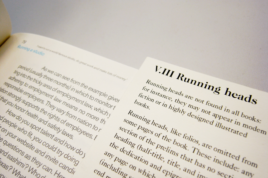
Below are the example of The Catcher in the Rye from Little Brown Books and How to be a graphic designer without losing your soul. Notice The Catcher in the Rye simply has a title and a page number and How to be a graphic designer has a lot more stuff going on.


So by having this loose form, people can realize that as formal as the writing may sound (and it may want to be), it is no Bible. I was playing with that contrast of two notions: formality and looseness.
That basically was where I've left off. I think the form really has been led by function and an idea.
Though I felt, I can push it being more practical. The choice of paper and typeface were suited to communicate the message of not a Bible and is nice almost as an art piece, but it just had so much potential to become a practical thing.
In a practical note, the bookmark system is useful because,
1) You can see an actual reference next to you while reading the text. Reading the text by itself can become confusing.
2) You can compare how different books done things differently, by bookmarking different books.
3) The act of bookmarking, actively seeking sections and parts, make you remember things better, since you are not just passively consuming information.
The problem with this paper stock was it was so thick. Ok it looks formal and precious and all but is not practical. Because there are so many bookmarks, the thickness of all bookmarks combined became thicker than the width a small paperback book. So you can't possibly do things like to bookmark different sections of a single book. Which you could when the paper stock was thin like shown in an image bellow. And, thick papers are hard to crop and they are pricey.

So, I'm introducing 'print out your own copy' idea. I need to thank Rathna and Duarte for this.
You print out just the ones you want. If you are writing about Running heads, you just print that section out. You usually don't need all sections. Whenever and wherever you are, you can always download it via internet. Since it's loose and it's easy to be lost, it's ok. You can always print new ones.
Testing how many bookmarks should fit in a A4 landscape paper:

When Printed:

I was playing around with gradient of black to gray to indicate orders. The order will be messed up once people start putting into books, and that may be interesting thing to notice/see. But then I didn't go for the idea at the end as I wanted it to only have minimum information and save as much ink as possible, since it will be using users' ink:


Pdf version. This is how it looks like when an user downloads all sections. Print out, cut straight lines, and it's all done! Some have more than one page so they'd fold dotted lines for those:


When user just want one particular section, this is what they can download. The sections repeat, so that users can bookmark different books to compare. Though they don't have to do that and could give them to friends, save them for later etc.

Because it's something you printed out with your printer, and you know you can always print another one, it feels inviting to take notes or scribble on the bookmark. I like it when design doesn't feel completely finished and doesn't feel intimidating, so that users can take ownership. I really like about this bookmark print out idea. (Just like what I did for my Context Essay)

I used orange shades to go with my booklet outcome for the website. First it look like these and not so much ideas were there:


Then I thought incorporating the shapes of the actual bookmarks. This screams less and match better with the atmosphere that the bookmarks have:

And gosh, this was the longest post to date...