Showing posts with label branding. Show all posts

Saturday, June 9, 2012

Five Days until the Degree Show

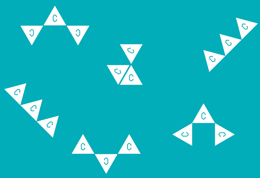
Central Saint Martins graphic design has 180 students this year. With such a large number of students, there are so many different relationships within the course. That variety of relationships is what makes us and the characteristic of our year.
So, we have developed this identity system that looks into the relationships between students. 

セントマ、グラフィックデザイン科は一学年180人。それだけの人数がいれば、少人数制の学部ではあり得ない様々な人間関係がある。そういった関係性こそが、うちのグラフィック科の特徴で強み!
と、いうことで、生徒同士の関係性に目をつけた、アイデンティティーでグラフィックデザイン科の卒展のブランディングを展開しています。


Website is in a good state. Lines look supa sexy.


Twitter background looking cool. (It is the official CSM Graphic Design twitter background, as well as some students' twitter accounts including mine)
Which by the way has impressive 6,000+ followers. I bet CSM BAGD is the most followed graphic design course twitter account in the world.

Facebook event page has a nice graphics too.

Cards sent the industry looked amazing. So was the press releases that were sent. Maps have been sent to the printer. Signage taking shape. It's progressing alright! I really am happy the way things are turning out that they have the same visual language, but are adopted in different situations and medium.


In the part of the website where the public cannot see, this is what happening among students. We calculate 'closeness' between students by gathering data on their pathways, choices of briefs, as well as students make their own groups and a little bit of social networking is going on. Using this data, leads the graphic. Genius programming and data visualization by Duarte. He is a genius.

卒展のサイトは、生徒しかアクセス出来ないページがあって、そこで今までにやったプロジェクトや、クラスに関する情報を集めました。生徒同士もみんな勝手にグループを作ったり出来て、ソーシャルネットワーク的なことが背後では行われています。内輪ネタや変なグループを色々作ったり出来て、楽しい。ちょっとした「卒業アルバム(yearbook)」的な役割を果たしていると生徒からの評判も上々。
「線と点」がただの「人と人の繋がりの象徴」ではなくて、ちゃんとどの生徒とどの生徒が近いというデータに基づいた自分たちを描き出しているのは、すごくエキサイティング。こんなことが可能なのは、いつも通りDuarteのおかげで、彼の頭の良さに、未だに日々驚く。


As mentioned before, this BAGD identity project is a collaboration project with Duarte and Esa.
This is a very rare degree show that is completely student led and all this couldn't been possible to be realised by amazing organisation by Kate.

Saturday, March 10, 2012

CCC: Meet Bob, Christian, Martha and Nikita

It's been a while since the last post about the collaboration project with CCC, but it's been progressing well!
We've been developing identities for their year group, which will also be used as visual elements to work with when we design the publication and the website.
Our initial proposal consisted of three ideas. We named them Bob, Christian, and Martha.


Firstly, meet Bob.
He consists of three triangles. The placement of three triangle is pretty much up to the person who's using it, giving freedom and flexibility.


Next, meet Christian.
He is probably the best used as small icons. I also liked him because he can be drawn in a single stroke, he could be something that people use as a little signature. It would be lovely to see people drawing it a bit differently from one and another, giving it a character.


Now, meet Martha.
She came from an idea that the course consists of 38 students. Each word is written with lines connecting 38 points. For instance, the C for criticism bellow is written with 4 points.


From the feedbacks we received from CCC and through further discussion, we came up with a final exit symbol. We named it Nikita.
And here is Nikita.
She is sort of a child of Bob and Martha. Have flexibility of Bob but the C inside is replaced by Martha. We also set a color for Nikita, which has ambiguity between blue and green, that we thought suits this course. It is also a nice striking color that is eye-catching.


All of us from Graphic Design (JT, Duarte, and Franek) attended One Day Font workshop ran by Kate and Agostino. We wanted to make Martha fonts with different points, so that CCC can install the font and use Martha themselves.
For instance, this is Martha has 6 points per letter.
We made Martha with 4 points per letter, 5, 6, and 7. They all have the same height and stroke width, user can mix different font within a word or a sentence.


We as a group did sketches and idea generations together. Here's some of my sketches.

Then we sketched on computer, testing different ideas.

Phew. A lot of work and effort have been put into. JT, Duarte, and Franek are mega awesome to work with.
I'm usually not too keen on branding, but I like this system where it allows a lot of room to play. The proposed contents from CCC is sounding exciting too, so looking forward to more of this!

Monday, June 27, 2011

Stefan Segmeister and the Notion of Branding

I was talking to a friend today about the difference between advertising and branding. He said advertising seem to be applied to a product and branding is more about the larger idea.

I grew to value less of advertising but I still have never disliked it. I just always thought it's not my thing, simply because it's seemed to be more about an idea, which is a very initial state of design process, and I'm rather interested in the whole process of making, which design allows me to do.

I have never been a big fan of a graphic designer Stefan Segmeister. I knew him from two of his works; one work was where he scratched his own skin to have writings on, and the other was where he photographed himself before and after of eating a whole lot of junk food. To be honest I loved both of the works but they both gave me an impression that he's a strange do-it-your-self typography guy.
Photo from Culture of Design

Photo from HITSPAPER

I recently came across his talks on Design Observer podcast and series of TED talks, which I actually loved. I loved what he said about Bali; especially since I've been there recently and I agreed with a lot of the things he's mentioned, but what I loved the most was his branding work of Casa de Musica in Porto.
Photo from Flux

The idea is simple. The logo is basically the shape of the architecture. You put an image into this specially made software, it picks up the colors used in the image, and put those colors onto the logo, making every logo different colors. I love this in so many levels namely:
1) Colors of the logo will always match with the image. No logo not working with image nonsense. Solves the problem that logos always had.
2) Great example of how technology aids an idea, without technology being the center of attention.
3) Such a good interpretation of Rem Koolhaas' architecture. Koolhaas' architecture are 3D versions of graphic design and it's just so relevant how Segmeister used it as a logo.

I really, still cannot get over how much I love this work by Segmeister. Never got as excited about branding as I have with this work, and I hope there are more of such in the world for me to discover.


今日、友達と広告とブランディングの違いについて話した。彼は「広告とはある特定の商品について行われるものだけれど、ブランディングというのはもっと大きなイメージについてであって、自分は広告には興味はないけれど、ブランディングは好き」と言っていた。
当たり前かもしれないけれど、デザインの学生が集まれば、自然とデザインの話をする。デザイナー同士のメールの内容は大抵デザイン関連で、今日のようにパーティーに行けば、酔っぱらいながらデザインについて議論する。同じ興味を共有する人が集まるわけだから、美大に入ったらそういう議論って自然と起こると思っていたのだけれど、大学生活の半分が過ぎてようやく、そういう態勢が出来上がった。たかが議論、たかが情報交換だけれど、それらはお互いに対する信頼や尊敬があってようやく成り立つ。

Photo from Flux

広告やブランディングという職業に対してあまり興味はないのだけれど、オーストリア生まれニューヨーク在住グラフィックデザイナーStefan Segmeisterのポルトにある音楽ホールのブランディングがとても好きで、「ああ、ブランディングというのはここまで面白く出来るものなんだ」と最近になって今更実感。
アイディア自体はとてもシンプルで、ロゴは音楽ホールの建築をそのまま取った立体的なキューブ。写真をソフトに入れると、自動的にロゴに試用する色を選んでくれる。これのどこが好きかというと、
1.ロゴと写真の色が常にマッチするから、ロゴを作成・試用することで常に問題だった「ロゴと写真の色が合わないよー!」ということが起こらない
2.テクノロジーに重点が置かれたデザインではなく、あくまでテクノロジーがアイディアを助けた良い例。
3.ホールを設計したレム・クールハースの建築の抜群な解釈。クールハースの建築は立体版グラフィックデザインみたいなもので、それをそのままロゴに持って来るというのは、とにかく適切。

ブランディングでここまでワクワク出来るなら、広告やブランドっていうのも面白いなーとこの作品を通じて思い直した。