Showing posts with label project. Show all posts

Thursday, March 14, 2013

Hello World! Processing with Handwritten Fonts

This post will be a record of some fun I've been having with Processing, using fonts from Family Typeface project.
Fort those who don't know what Processing is, it is:
Processing is an open source programming language and integrated development environment (IDE) built for the electronic arts, new media art, and visual design communities with the purpose of teaching the fundamentals of computer programming in a visual context, and to serve as the foundation for electronic sketchbooks.
(via Wikipedia)

Processing.js uses JavaScript to allow Processing to be viewed on Web browsers. HOWEVER dealing with font files with Processing.js seems to get complicated (alsoko: Using custom fonts with processing.js) so I'm skipping that for now. I'm just gonna demonstrate it using screengrabs here. Any Processing.js font use tip is appreciated. The alsoko link above was a good read actually, tells useful things like it's better to use a .ttf files (of which I wasn't doing).

Any how, here are few directions that I've been trying:


1) Outputting using all fonts

When you have so many fonts, manually changing them is a pain in ass. Hence employing an automated process becomes greatly helpful.
Displaying “Hello!” in sequence of otf files turned out to be surprisingly easy.
What, on the other hand, turned out to be difficult was creating line breaks when each column reaches the height. I cheated by doing math myself and manually specifying the values for when to line break. That's sort of ridiculous and the code gets ugly as you can see bellow. Naturally, I need to find a better way of doing this, but this whole process of testing and figuring out things by myself is a part of the learning curve so it's all good (and fun).


2) Random font

Everytime you click the window, different font is being used:
It shades slowly so different typefaces overlap.
This code is pretty straight:


3) Type and random font

A variation from the idea above–when screen is being clicked, it changes the font. Difference is that instead of having a preset text, users can type in whatever text they want to display.
I used Andreas Schlegel's Control IP5 library for the textfield.
This has a lot of potential, me thinks.


For now things are basic but I'm hoping to build from those ideas. If this develops into some cool collision of analogue and digital, that would be super exciting.

プログラミングって数学ですねー。少なくともわたしのやろうとしている範囲の表現では、高度な数学を知っていることよりも、中学レベルの数学を「完璧」に出来るということが重要な気がします。なかなか自分の思ったようにいかないのが悔しいけれど、証明問題を解く感覚に似ていて楽しい。中高のとき、証明問題を解くの好きだったことを思い出します。
そういう意味では、本性的に向いている気もするし、細かい集中力に欠けていたりしてあまり向いていない気もしたり。どちらにせよ、もっとコードを使って表現出来るようになりたいです。

Tuesday, December 25, 2012

Website Update


I updated my website shihoyokoyama.com

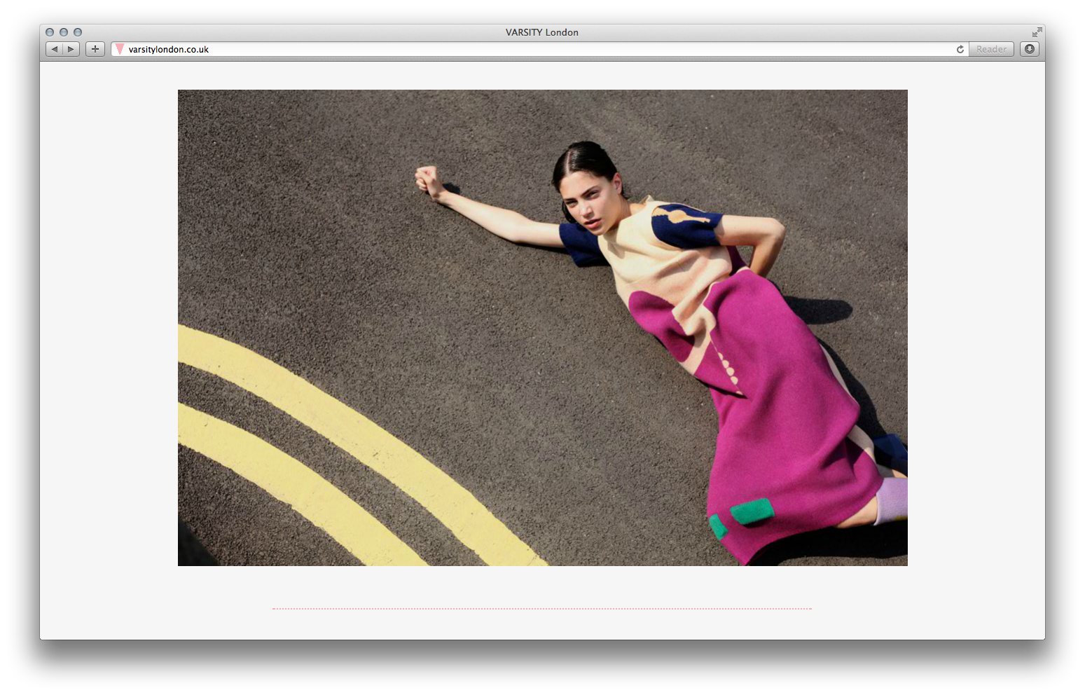
I added a not-so new project VARSITY London, and added few photos from Newcastle and Amsterdam from the summer.

I don't update my website as much as I probably should do, and I rarely visit it myself but now that I visit it, I quite like how curated it is. While my facebook, twitter, instagram or this blog, tend to have my ideas and thoughts all over the places, the website only includes finished stuff, which is rather calming. It sort of is how I'd like my personal room to be.

I also organized what was becoming a chaotic top page with all the animated gifs.
I'm getting rid of the less successful ones, but I feel sad deleting all of them at once so I'm going to post them here as a memorial:

Friday, December 21, 2012

Megan on VARSITY London


VARSITY London's editor Megan Wray Schertler talks about concepts behind the magazine.
This lovely short film is by Ian Giles.

Of course you can still read the issue on VARSITY website.
As well as read my last blog post here.

Friday, November 23, 2012

The Art of Handwriting

It's been quite a while but my degree show project was featured in the blog of Blueprint magazine... in August. Yeah this has been a while.

そういえば・・・な話なのですが、英国の建築雑誌Blueprintのブログに作品が8月に載りました。卒業生特集。

http://www.blueprintmagazine.co.uk/index.php/architecture/best-of-student-shows-2012/

I'm pleased that my work somehow made it to the eyes of prestigious architecture magazine. Maybe my pseudo-intellectual affection for architecture has finally paid off. That was worth it.

スクリーンショット、殺風景すぎる・・・。クールなサイトだなあ。
建築好きとしては、建築の雑誌に気に入ってくれて嬉しいです。この雑誌ちゃんと読んだことないけど、賢そうな雑誌です。

- - -

Also, I was fortunate enough to expand this project into larger community of people. i.e. even to the people who don't attend graphic design shows. Thank you to the publisher Pan Macmillan for running this campaign with me.

そんでもって、出版社Pan MacmillanとPhilip Hensherの新しい本、"The Missing Ink"のキャンペーンをやったりしました。
http://www.panmacmillan.com/missingink

The new book by Philip Hensher The Missing Ink is for handwriting lovers. The book explores the history and different stories/aspects around handwriting. Because the subject is handwriting, which is rather a hart-warming subject, the book makes a perfect gift option for Christmas. Available in Kindle too, which is definitely a big plus (making international gifts easier). A bit of a biased promotion aside, and even though I felt some bits more interesting than other, you can show off knowledge such as how much Hitler hated writing by hand, just like how I've been doing.

Well the only thing I can say is, I hope Mr. Hensher didn't mind my photo being featured rather large next to his book for the campaign site. It's a complete honor really.

You can see the handwriting of people who have participated here:
http://storify.com/zoldie/the-missing-ink
It's just great communicating with people like this way, especially since graphic designers don't usually get to see the faces of our audience and don't have opportunity to hear their reactions.

自分の顔がキャンペーンサイトに大きく載ってびびった。Hensherさんの本なのに、わたしがこんなに目立ってよかったのでしょうか。

キャンペーンは(たぶん)もう締め切っているものの、わたしは今これを納品している最中。頑張ってます。

キャンペーンを通じて色んな人が、ツイッターを通じて、自分の手書き文字を送ってくれて、なかなか面白かったです。わたしは、こういう作品を通じた交流が好きだなあと、手書きフォントプロジェクトの一連を通じて思ってます。

みんなの手書き文字の記録はこちらから見れます。
http://storify.com/zoldie/the-missing-ink

- - -

Some great feedbacks include like this one here by Gwyneth Holland:
こんなブログにも取り上げていただき、嬉しい限りです。
http://howthingsaredone.wordpress.com/2012/10/19/penmanship/

ちなみに、このプロジェクトが賞を取ったと書いてありますが、わたしの知る限りではなにも取ってません。もしわたしの知らないところで取っていたとしたら、誰か教えてください(もしくは、賞ください)。

- - -

To those who participated at my space in degree show, the project is very slowly progressing. I'm possibly one third done? If you send me an email with your name (and preferably which day you attended if you remember), I can work on yours first.

Note* I am not creating any more handwriting fonts unless you have taken part at the degree show.

- - -

I just realized I haven't really blogged about this project in full detail. I guess I've been thinking I should finish it before writing about it, but it's taking more time to complete than I have initially anticipated back in June. I'll really try to write about it sometime though. It has been one of the most exciting project I have ever done, and one of my favorite projects ever.


Friday, October 12, 2012

VARSITY London is Live!

I've assisted a project VARSITY London by Megan Wray Schertler (editor) and JT Yean (designer).
It's a magazine that catalogues almost all MA fashion graduates of 2012 from CSM, RCA, and LCF.
It is aiming to be an annual magazine, allowing audience to compare the talents from different schools and different years.

Currently VARSITY London is available online.
From the site you can also download PDF (for non-Flash supported devices), and on Issuu (for slower internet connections).

Here is how the site looks like:

Some sample spreads:


Wanna see more? Of course you do! Please visit VARSITY London website to view the full magazine.

VARSITY London is also throwing a launch party on SimmonS in Kings Cross on Thrusday 18th October 2012. Please RSVP tovarsitylondon@gmail.com!


VARSITY Londonの制作に携わりました。
いわゆる、季刊のコレクション雑誌の学生版。学制版とはいえ、ご存知の通り、ロンドンのファッション大学のレベルは高く、学生とは思えないような作品ばかりなので、見応えはたっぷり。年刊雑誌としてやっていく予定なので、今後、各年や各大学ごとの個性がもっと比べられるようになると、アーカイブとしても重要度を増すはず。ポテンシャルがあるアイデアなので、是非この先も上手く行ってほしいところ。

今年度に関しては、2012年卒のエディターとデザイナー3人が作った、2012年卒のファッションデザイナーを特集した雑誌、となっております。

是非サイトの方で内容をチェックしてみてください。 varsitylondon.co.uk

Monday, June 11, 2012

Degree Show Signage WIP


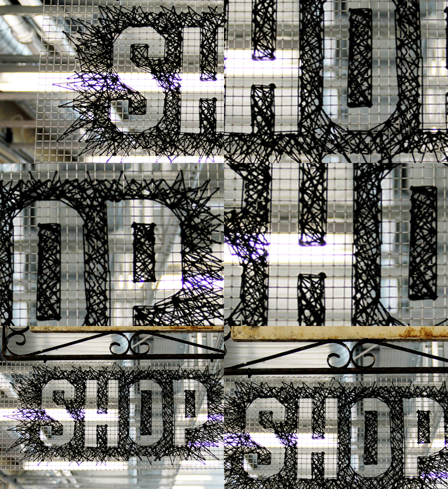
Signage for the degree show is slowly but surely taking shapes.
Above is sexy Boo promoting Illustration pathway.
Bellow are the initial tests:


While Duarte is mainly responsible for the digital side and Esa for print, I have been in charge of signage for the degree show.
It is a rather slow process. We have already used 1.2km (!) of yarn so far and still counting. This signage idea could not have been executed by myself and is really a collaborative effort of people involved in this show. Thank you everyone who worked on it, I am especially grateful because I know everyone's all so very busy preparing for your own space for the show.
The signage is created by: JT, Alessia, Lillian, Boo, Clare, Kate, Kristina, Matt, PietroDuarte, Nathalie, Sara and Renata, Together, we are Cool Calm Collective.

It turned out, this is such a nice collaborative outcome to finish the course with. It involves a lot of people that I've never worked with before.
Still in a process of finishing up, but getting positive feedbacks around, we are pretty excited about it.


実際の空間(メタルのグリッド)とアイデンティティー(プリントとウェブに使われている黒い線)を繋ぐ、標識や看板のシステム。アイディアとしてはとてもエキサイティングなのだけれど、やり始めて自分ひとりでは絶対に終わらせることが出来ないということを悟り、Facebookで助けを求めたら、あまり親しくない友達までも助けてくれて、かなり感動。既に1.2キロメートル(!)もの毛糸を使い切り、ゆっくりではあるものの、卒展までには間に合いそうなので、一安心。


When you work in a pair, one needs to play a chicken in a cage role.

Saturday, June 9, 2012

Five Days until the Degree Show

Central Saint Martins graphic design has 180 students this year. With such a large number of students, there are so many different relationships within the course. That variety of relationships is what makes us and the characteristic of our year.
So, we have developed this identity system that looks into the relationships between students. 

セントマ、グラフィックデザイン科は一学年180人。それだけの人数がいれば、少人数制の学部ではあり得ない様々な人間関係がある。そういった関係性こそが、うちのグラフィック科の特徴で強み!
と、いうことで、生徒同士の関係性に目をつけた、アイデンティティーでグラフィックデザイン科の卒展のブランディングを展開しています。


Website is in a good state. Lines look supa sexy.


Twitter background looking cool. (It is the official CSM Graphic Design twitter background, as well as some students' twitter accounts including mine)
Which by the way has impressive 6,000+ followers. I bet CSM BAGD is the most followed graphic design course twitter account in the world.

Facebook event page has a nice graphics too.

Cards sent the industry looked amazing. So was the press releases that were sent. Maps have been sent to the printer. Signage taking shape. It's progressing alright! I really am happy the way things are turning out that they have the same visual language, but are adopted in different situations and medium.


In the part of the website where the public cannot see, this is what happening among students. We calculate 'closeness' between students by gathering data on their pathways, choices of briefs, as well as students make their own groups and a little bit of social networking is going on. Using this data, leads the graphic. Genius programming and data visualization by Duarte. He is a genius.

卒展のサイトは、生徒しかアクセス出来ないページがあって、そこで今までにやったプロジェクトや、クラスに関する情報を集めました。生徒同士もみんな勝手にグループを作ったり出来て、ソーシャルネットワーク的なことが背後では行われています。内輪ネタや変なグループを色々作ったり出来て、楽しい。ちょっとした「卒業アルバム(yearbook)」的な役割を果たしていると生徒からの評判も上々。
「線と点」がただの「人と人の繋がりの象徴」ではなくて、ちゃんとどの生徒とどの生徒が近いというデータに基づいた自分たちを描き出しているのは、すごくエキサイティング。こんなことが可能なのは、いつも通りDuarteのおかげで、彼の頭の良さに、未だに日々驚く。


As mentioned before, this BAGD identity project is a collaboration project with Duarte and Esa.
This is a very rare degree show that is completely student led and all this couldn't been possible to be realised by amazing organisation by Kate.

Thursday, May 31, 2012

Two Weeks until the Degree Show

Being busy with the work for the degree show. Not at all for my space, but for website and branding of BA Graphic Design.
Working with Esa for the first time, and as always Duarte. Also working closely with Kate and Agostino.

Visit our degree show website, which is currently looking like this:

You can check Facebook event page.

If you are in London, you'd notice massive digital billboards promoting our show. Designed by KateAgostino and Krista.


It's nice to be in a year that we feel that people, both our year group and the college, actually do care about the show.

Other parts of the college is looking exciting too. It will be fun!