Showing posts with label text to book. Show all posts

Monday, April 2, 2012

From Text to Book – Bookmark Idea Digital ver.

I can't believe I'm still working on the first project of the year, but anyway. I have two outcomes and I'm happy with my booklet outcome (I call this finished) but still slowly expanding my bookmark idea.

This bookmark says with its visual language (i.e. thick paper, formal typography) this is a scary formal piece of rule that you should obey. The whole writing did sound like a formal rule so I gave a visual appearance of it.


Reading the writing, you may think it is a formal rule, like a bible, but if you look at how different books write their books, you see a lot of variations within it. For instance not all books have appendix, bibliography, or an errata slip.
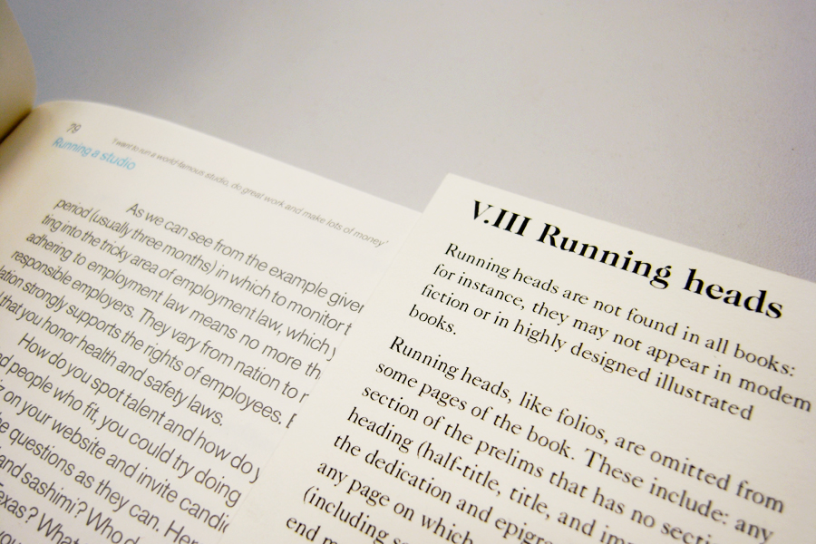
Below are the example of The Catcher in the Rye from Little Brown Books and How to be a graphic designer without losing your soul. Notice The Catcher in the Rye simply has a title and a page number and How to be a graphic designer has a lot more stuff going on.


So by having this loose form, people can realize that as formal as the writing may sound (and it may want to be), it is no Bible. I was playing with that contrast of two notions: formality and looseness.

That basically was where I've left off. I think the form really has been led by function and an idea.
Though I felt, I can push it being more practical. The choice of paper and typeface were suited to communicate the message of not a Bible and is nice almost as an art piece, but it just had so much potential to become a practical thing.

In a practical note, the bookmark system is useful because,

1) You can see an actual reference next to you while reading the text. Reading the text by itself can become confusing.
2) You can compare how different books done things differently, by bookmarking different books.
3) The act of bookmarking, actively seeking sections and parts, make you remember things better, since you are not just passively consuming information.

The problem with this paper stock was it was so thick. Ok it looks formal and precious and all but is not practical. Because there are so many bookmarks, the thickness of all bookmarks combined became thicker than the width a small paperback book. So you can't possibly do things like to bookmark different sections of a single book. Which you could when the paper stock was thin like shown in an image bellow. And, thick papers are hard to crop and they are pricey.


So, I'm introducing 'print out your own copy' idea. I need to thank Rathna and Duarte for this.

You print out just the ones you want. If you are writing about Running heads, you just print that section out. You usually don't need all sections. Whenever and wherever you are, you can always download it via internet. Since it's loose and it's easy to be lost, it's ok. You can always print new ones.


Testing how many bookmarks should fit in a A4 landscape paper:

When Printed:

I was playing around with gradient of black to gray to indicate orders. The order will be messed up once people start putting into books, and that may be interesting thing to notice/see. But then I didn't go for the idea at the end as I wanted it to only have minimum information and save as much ink as possible, since it will be using users' ink:


Pdf version. This is how it looks like when an user downloads all sections. Print out, cut straight lines, and it's all done!  Some have more than one page so they'd fold dotted lines for those:


When user just want one particular section, this is what they can download. The sections repeat, so that users can bookmark different books to compare. Though they don't have to do that and could give them to friends, save them for later etc.

Because it's something you printed out with your printer, and you know you can always print another one, it feels inviting to take notes or scribble on the bookmark. I like it when design doesn't feel completely finished and doesn't feel intimidating, so that users can take ownership. I really like about this bookmark print out idea. (Just like what I did for my Context Essay)

I used orange shades to go with my booklet outcome for the website. First it look like these and not so much ideas were there:


Then I thought incorporating the shapes of the actual bookmarks. This screams less and match better with the atmosphere that the bookmarks have:
You can visit the site from here but the links are broken because I'm not aware of the copyright of this material. Hart's Rules was first published in 1893 but since it's a New Hart's Rules, I don't know much about it. To avoid trouble, I'm links are broken for now. The idea is, when you click Download all, you get the PDF, as well as you can download each sections individually.

And gosh, this was the longest post to date...

Wednesday, February 22, 2012

From Text to Book Revised

I have finally completed The parts of a book project for from text to book brief. It was developing and changing nifty little things, like typographic details, making different versions and slowly improving the appearance and usability. While I was doing this, I realized if I do it well, it's something I would really like to use myself and that motivated me to make a good one. I am happy with the outcome so I'm actually planning on using it.

This is basically how it would look in action. You take a relevant section out, it's small doesn't take up too much desk space, and it lay open flat.

Sourcing the right paper was possibly one of the hardest challenges. Thankfully I came across this amazing paper shop in Tokyo while I was there during the winter holiday.

Walls are made up of drawers and shop keeper lady takes out your requested kinds of paper from those drawers. How cool is that?!
The shop has another room for cutting paper for you and deal with big sheets. Upstairs is a little gallery and when I went they had an exhibition about bookbinding and book covers. I can completely imagine few of paper lovers from CSM would absolutely love this place. And the price is much cheaper than it is in London, despite everything else in Tokyo being more expensive.
The shop stocks 2,700 kinds (!) of A4 paper and you can see and touch all these samples. At the back of the shop, they also stock 1,800 kinds of paper in large format, which they can cut for you. You can also order anything that is not in stock at the shop. In fact, their online store stocks 9,000 different kinds of paper. Seriously, we need this in London.

(above) This is how you request kinds of paper in the shop. Just like at Falkiners.

(bellow) The top row is the newly bought paper. The bottom row is the paper I previously used for my final crit. Notice the top row is much smoother and is more appropriate for this project.

Visit Website for TAKEO for more information about the store and its showroom.


見本帖本店に大興奮。
グラフィックデザイナーが紙の話をするのは、あまりにもステレオタイプ的で、馬鹿みたいなのはわかっているのだけれど、仕方ない。感情には逆らえないので、ひとりで大興奮。
私個人的には、色がとにかく大好きだから、グラデーションがあると無意味に感動しちゃう。だから、グラデーションを用いてた今回のプロジェクトは、そんな私が個人的に幸せになれるプロジェクトでした。番号をふらなくても、一目で順番がわかるようにとか、工夫は色々あるのだけれど、とりあえあず、ややこしい文章のものから、幸せで使いやすいものを作りたかった。出来上がりもハッピーな感じで!
見本帖本店さんは、色もそうだし、質感や、重さや、密度も、本当に色々な紙が揃っていて、グラフィックデザイナー以外の人も楽しめるはず。意味もなく、グラデーションで紙を買いたくなると思う。
見本帖本店ショールーム・ウェブサイト & Takeo Paper オンライン・サイト

Thursday, December 22, 2011

From Text to Book WIP and Final Crit

Idea 1
Things I've changed since the first version: different the typeface of the main text, created covers for each sections, had an idea of moving the table of contents for the case and having general principle as a separate chapter, fatter dimension of the book (the height is now a bit shorter than A5), each section having different width so that the titles can be seen when slipped into the case, and paper and colors have been picked.

One of the hardest parts was to select the colors and create a smooth gradient. I've collected different shades of yellow from different paper shops and that ended up as a bit of a nightmare to organize. Here are some of my tests:
At the crit people suggested me it would have made more sense to have 1 in between 3 and 4. I think it's necessary to find a paper stock that stocks different shades of colors to match the hue and really to create a better gradient.

Here is the completed version with the case and all the booklets:


Idea 2
The following image is some of the development of the design. It is hard to see from the photo but they are the tests with different stocks of paper.  At the end, I went for the yellow-shade heavy stock paper as it gave formality ans seriousness to the impression. I chose serif typeface, because I wanted it to have formal feel to it as the writing itself had formal and somewhat authoritarian impression, demanding the readers to follow the rules. This writing sounds formal like telling you ultimate rules (hence the serif type and heavy stock paper) but actually that is not the case as different books do things differently (which can be realized when using those bookmarks in different books).

The design considered how the bookmark looks when the book is being closed, as well as when it is being in used:

The disadvantage of using heavy stock paper is that it is simply too thick to put all the bookmarks in a single book. Bookmarks ended up being fatter than a small paperback book:

These images bellow shows the bookmarks being in use. The reader can see the actual page that the text is referring to, while reading the text. It provides an example of an execution by putting things into context. At the same time comparing different books allow the reader to see that there is no one ultimate way.
It turned out to be idea 1 and idea 2 became two almost very opposite ideas. Idea 1 is all about usability and idea 2 is more of a study of different books. I think at current stage, I still thought about usability of idea 2, making it sort of usable, but I think it would be a way more interesting if I can ditch the usability of idea 2 and really focus on "how to show that different books write and present information differently, and there is no ultimate rule to it".
Some ideas I have received at the final crit was to use a linear color gradient for the color of paper and seeing how the gradient would be disordered for different books.


Final Crit
Some of the photos taken at the final crit. The ones here are some interesting ones in terms of scale and forms, but there were many other great executions. I particularly loved Gabriel's piece (which I didn't take any photo).


本を作る時に、エディターや、デザイナーが知らなくてはいけない、文章や校正についてのルールの文章。その文章を使って、本をデザインするプロジェクト。
アイディア1は、難しくてわかりにくい文章を、なるべく楽しく、アクセスしやすいヴィジュアルとして見せるか、というユーザーの視点に立ったデザイン。アイディア2は、まったく同じ文章なのだけれど、あえてその難しい文章を、そのまま「正装」させたデザイン。ただ、こちらはブックマークとして使えるようになっていて、実際の本が一体どのようにルールに従っているかがわかる仕掛け。文章だけ読んでもわかりにくいので、横に実物の本を見ながらやればわかりやすいかな、という発想がきっかけとなったデザイン。ただ、それを通じてわかるのは、一応これはルールについての文章だけれど、本によってアプローチの仕方はまったく異なっているし、「絶対のルール」なんてものはないのだということ。現存の本の多様性が、ブックマークをするという行為を通じてわかるようになる。

Tuesday, December 13, 2011

From Text to Book WIP (part.2)

Idea no.2
The writing was confusing just on their own and I thought it would be a good idea to read the text while looking at an example of actual book. This idea is separating writing into loose paper, inserting them into an actual book, to provide an reference of the text in order to enhance the reading experience of this confusing text.
I personally thought this was a weaker idea, as it seemed like I would be treating the book of my choice as a perfect example. However, at the interim-crit, I've presented both ideas and through feedbacks I've realized it would be interesting to create bookmarks, that allow readers to compare and contrast how different books can have different ways of displaying information. This text sound like a rule book, where things must be kept in a certain way, but that is actually not the case and different writers and publishers all practice in different ways. The idea of creating bookmarks can possibly highlight this point.

Above images are a study of how different sections could be fit into a single book. I've inserted the relevant texts in relevant pages of the book.
I've found out that some sections can belong in multiple locations, after inserting the text it is difficult to navigate text to relevant places, and the left over text suggest that books don't contain all the things that were talked about in the text.
The last image shows the leftover texts that this particular book did not contain.

Friday, December 2, 2011

From Text to Book WIP

I am pretty good at post-rationalizing. I genuinely believe that things become clear and everything makes sense at the end of a project and if it doesn't, it means I haven't thought-through enough. Well, sort of. I guess not everything works that way, but my most successful projects were the ones that I felt that different thinking and concepts came together in a clear way at the end.

My blog has been a place for this amazing post-rationalism, where everything here seem to have clear ideas and makes total sense, but obviously that's not the process that I've gone through. It's quite difficult to be blogging while you are doing a project, mostly due to a lack of time, but I'll try and record my process from now on.


We all were given texts about reference of stylistic information on what to include in a book, aimed for designers, writers, editors, and publisher. The text contained full of mistakes, our first task was to correct them.
It's a very useful and practical piece of writing, but it sounds/looks too scary and feels quite authoritarian.

Idea no.1
To make it more practical, I've divided the sections into different books. When you are writing parts, you probably know which section you are working on. You only need the writing about the part that you are currently working on, not the entire book. Everything is contained in a box with general principle, and idea is you just pull out the section that you need, and that sits small and nicely on your desk.


Yes, bright use of colors. I've only realized now that I do this quite often. During interim crit, I realized that I really remember things by colors. Hence how I organize my iPhone and iPad. People tend to get confused looking at them because I think people tend to categorize by themes? But this really works for me; I know which color each app has (a bit of a disaster when they suddenly decide to change its color).


Our tutor Paulus was saying, not particularly to me but in general, that it is much more effective if differentiation of sections were made by typographic detailing not just relying on the blunt uses of colors. That I completely agree.
My rationale behind use of colors and typefaces were that the writing seemed scary and I wanted to make it more friendly and approachable. So I think this particular idea has a point in using colors, but definitely Paulus' point was something to be noted. Especially for someone like me, who tend to be attracted to colors whenever there's a need for categorization.


上手く行けば、プロジェクトの最後には、大体もやもやとしていたことが、クリアになって意味が通じる。だから、プロジェクトについて話す時に、「これはこうこうといった動機で、こうこうというものを作りました」とシンプルにまとめることが出来る。
クライアントや、外の人に、自分のプロジェクトを説明する際には、そういう跡付けの合理化や正当化はかなり重要。簡単に説明できないとわかってもらえないから。

でも、実際のプロセスは、そんなクリアで合理的なものでは全然ない。笑。最後のアイディアに辿り着くまで、無駄なことをたくさんしている。そういうのって、他の人は知る必要はないと思うし、例え努力の結果だとしても、努力を感じさせないクールでスマートな完成品に辿り着く方がいいと思う。でも、大学はプロセスが大事、プロセスが大事、と言う。大学は学びの場だから、クールなプロダクトよりも、血と汗にじむ努力や試行錯誤の方に興味がある。というわけで、これからは出来る限りプロセスについても忘れないようにメモしていきたい。でも、プロセスについてまで書き始めると、キリがない・・・。