Tuesday, March 27, 2012

Comme des Garçons's Soul and Spirit

The new Aoyama shop will be the purest incarnination of Comme des Garçons's soul and spirit
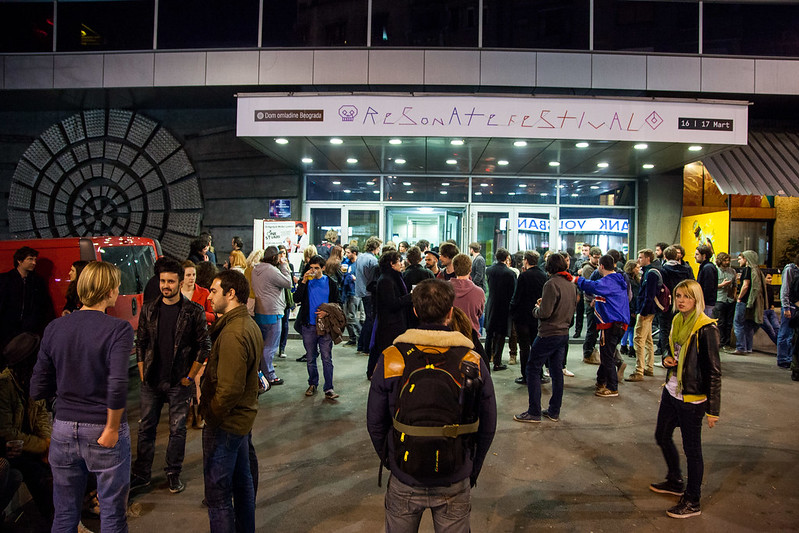
says the invite for new Comme des Garçons Aoyama store.


Comme des Garçons is probably the rare and only exception of brand that I can think of, whom feel right to talk about "soul" and "spirit".
There are few talented fashion designers around the world who make beautiful beautiful clothes, but Comme des Garçons seems to be more than that. My attitude towards fashion would have been different if I haven't known this brand. And I believe I'm not the only one who thinks like that.

Perhaps words like soul and spirit may also suit Lee Alexander McQueen. But then again, as beautiful as their recent collections are, I don't know whether his brand still suits those words.


世界には、天才的なファッションデザイナーが幾人かいるけれど、「魂」と「精神」という言葉が似合うブランドは、ギャルソン以外にない気がする。
そもそも、普通のブランドは、「魂」と「精神」なんてさらりと言えないよね。
アレクサンダー・マクイーンからも魂や精神みたいなものは感じるかもな、と思ったけれど、彼自身はそうでも、彼のブランドは、魂や精神とはちょっと違う気がする。

私は、ギャルソンと出会ってなかったら、ファッションに対して全く違う価値観を持っていたと思う。ギャルソンに対して、そういう風に思っているひとは、世の中にきっとたくさんいる。


「すぐ着られる簡単な服で満足している人が増えています。他の人と同じ服を着て、そのことに何の疑問も抱かない。服装のことだけではありません。最近の人は強いもの、格好いいもの、新しいものはなくても、今をなんとなく過ごせればいい、と。情熱や興奮、怒り、現状を打ち破ろうという意欲が弱まってきている。そんな風潮に危惧を感じています」 

「ファッションの分野に限らず本当に個性を表現している人は、人とは違うものを着たり、違うように着こなしたりしているものです。そんな人は、トップモード(流行の最先端)の服でなくても、Tシャツ姿でも『この人は何か持っているな』という雰囲気を醸し出しています。本人の中身が新しければ、着ているものも新しく見える。ファッションとは、それを着ている人の中身も含めたものなのです。最近はグループのタレントが多くなって、みんな同じような服を着て、歌って踊っています。私には不思議です」 

「ファッションは非常に感覚的なものなので軽く見られがちですが、実は人間に必要な力を持っています。理屈やデータではなくて、何か大事なことを伝えて感じてもらう。アートとも違って、人が身につけることで深い理解が生まれます。軽薄とみられがちな部分も含めて私はファッションが好きです。ファッションはたった今、この瞬間だけのもので、それを今着たいと思うから、ファッションなのです。はかないもの、泡のようなもの。そんな刹那(せつな)的なものだからこそ、今とても大切なことを伝えることができるのです」

朝日新聞 川久保玲さんロングインタビューより

Monday, March 26, 2012

Resonate Festival

Here it is, Resonate festival.
Our friend Clara is exceptionally friendly, cheerful like a sunshine and she made loads of friends. So I too got to talk to strangers, which was fun.
Talks and conferences during the day, live music acts at night. Beers on sale throughout the day and night. Extremely sunny two days. It was a great festival indeed.

Our favorite event of all was a tram ride with Uros Djuric. Super informative and subjective tour of Belgrade. We listened to Serbian Punk music from 70s, it was so loud made pedestrians stare with surprise or some occasionally danced.

Here are the photos from Resonate Festival's Flickr:


レゾネート・フェスティバル、イン、ベオグレード。
フェスティバルというよりは、レクチャーで構成されたカンファレンス的な催しなのだけれど、同時進行で色々なイベントが行われていて、自分で好きなように予定を組んでハシゴして行くのは、フェス的な感覚。夜は、コンサート。前衛的な音楽なのに、観客ノリノリで拍手喝采で、驚いた。ベオグレードという辺鄙な土地で、最先端を行ったフェスでした。

レクチャーのクワリティーも高く、会場のムードも良かったのだけれど、一番楽しかったのは、トラムツアー。ファンキーなアーティストUros Djuricのガイドで、大音量でセルビア音楽(主にロックやニューウェーブ、時折パンク)を聴きながら、街を回った。

写真はResonate Festival's Flickrより:


Sunday, March 25, 2012

Belgrade

I went to Belgrade in Serbia with fellow DSI (Digital Special Interest group) mates to attend Resonate Festival. The festival was fantastic with surprisingly amazing line-up, and we really had good time in Belgrade too.

I had no preliminary knowledge of Belgrade or Serbia. My knowledge was so limited I only discovered after going there that it used be the former Yugoslavia. People spoke English, we had good weather, food and beer were nice and cheap, I can only recommend the place. Rebecca, an American tutor who came there with us said that the entire city is a hipster town like Brooklyn of NY or East End of London. Graffiti covers the walls around the city, there are many nice bars around, it reminded me of Berlin.
Oh and from street name signs to graffitis, the city had incredibly interesting and amazing typography. That too was a good surprise.

なんの予備知識もなしに、行ってきたセルビア共和国の首都、ベオグレード。ちなみに、旧ユーゴスラビアの首都。そもそも、わざわざベオグレードに行った理由はResonate Festivalというデジタルアーツのカンファレンスに出席するため。デジタルデザインに興味がある人なら驚くくらい豪華なラインナップ。

英語は通じるのか?別の友達が行った時は、物乞いの子供が電車の窓を叩いていたらしいけど、大丈夫なのか?食べ物は美味しいのか?とりあえず、あまり深く考えず行ってきました。
結果的に、英語はフランスやドイツよりも通じるし、ホームレスや物乞いの人なんてひとりも見なかったし、食べ物は重いけど美味しいし、街自体も好きでした。ビールが1ボトル50円くらいなのが良かった。物価は安くて、タバコも一箱100円くらいだった。

ニューヨーク出身の先生が、「なんでベオグレードなんかで開催するかわからなかったけれど、街全体がヒップスター・タウンで、ニューヨークのブルックリンや、ロンドンのイーストエンドみたいで、なんでこの街で開催したかわかった」と言っていた。気取らずお洒落なバーが並んでいて、町中がグラフィティに覆われていて、雰囲気としてはベルリンに近い。ベオグレードが「次のベルリン」になる可能性はあると思う。


大抵、旅行では、「行きたい場所」を選んで、「見たいもの」を見る。貧しい国も、過酷な自然も、素晴らしいアートや建築も、そういうのを見たいと思って行って、「想像と一緒だね」とか「生で見たって言える」とか「想像とこういうところが違ってた」なんかと思って終わる。結局、ネットや情報の予備知識があるから、本当に考えが覆されたり、心から感動したりすることがない。感動するのが難しい時代に生きていると思う。

今回は、予備知識なしで、とりあえず行ってみて、ゼロから歴史や街や人について知って行くという貴重な経験だった。特別な感動はなかったけれど、予備知識をなぞるだけの旅行ではなかった。たぶん、私が好んで、知り合いの国を訪れるのも、「私が見たいもの」ではなくて、「彼らが知っているもの」を見せてくれるのを望んでいるからなのだと思う。応募したら、ランダムな国行きへの航空チケットを買ってくれるサービスとかあったら、ちょっと興味があるかな。


Monday, March 12, 2012

Illustration Work In Progress Show Opens Tuesday

Central Saint Martins, BA Graphic Design, Illustration pathway guys are having a show, which opens from Tuesday.
And the poster that Clara Yee designed for it is absolutely stunning! I am in love!
She has taken color palettes of participating students' works and using those colors, she created this nice typography. It's really funny how colors really represent individuals. Clara has taken colors from people's works but I suppose what people wear tend to be similar to what they use in their works, and that's why without not knowing a lot of people's works, I can really see how those colors match with their personalities. I wish I was participating too and she made one with my works too!

Their show website is so charming too. Even the favicon is adorable. Making me jealous!

The show takes place at Blackall Studios in Shoreditch. I am definitely attending the private view on Tuesday night, so see you there!


うちの学科のイラストレーター達が、ShoreditchのBlackall Studiosというギャラリーで今週の火曜日から展示をします。参加する人たちの作品から色を取って、タイポグラフィーにした、Claraがデザインしたポスターが素敵すぎる。知り合いからすれば、「あーこの人こんな色のイメージだよねー」と納得な感じで、色でうまく人を表している。作品の色合いと、本人が普段着ている服は、似ている気がする。
私も、オープニングナイトに遊びに行く予定。ロンドンにいる方は是非。

Saturday, March 10, 2012

CCC: Meet Bob, Christian, Martha and Nikita

It's been a while since the last post about the collaboration project with CCC, but it's been progressing well!
We've been developing identities for their year group, which will also be used as visual elements to work with when we design the publication and the website.
Our initial proposal consisted of three ideas. We named them Bob, Christian, and Martha.


Firstly, meet Bob.
He consists of three triangles. The placement of three triangle is pretty much up to the person who's using it, giving freedom and flexibility.


Next, meet Christian.
He is probably the best used as small icons. I also liked him because he can be drawn in a single stroke, he could be something that people use as a little signature. It would be lovely to see people drawing it a bit differently from one and another, giving it a character.


Now, meet Martha.
She came from an idea that the course consists of 38 students. Each word is written with lines connecting 38 points. For instance, the C for criticism bellow is written with 4 points.


From the feedbacks we received from CCC and through further discussion, we came up with a final exit symbol. We named it Nikita.
And here is Nikita.
She is sort of a child of Bob and Martha. Have flexibility of Bob but the C inside is replaced by Martha. We also set a color for Nikita, which has ambiguity between blue and green, that we thought suits this course. It is also a nice striking color that is eye-catching.


All of us from Graphic Design (JT, Duarte, and Franek) attended One Day Font workshop ran by Kate and Agostino. We wanted to make Martha fonts with different points, so that CCC can install the font and use Martha themselves.
For instance, this is Martha has 6 points per letter.
We made Martha with 4 points per letter, 5, 6, and 7. They all have the same height and stroke width, user can mix different font within a word or a sentence.


We as a group did sketches and idea generations together. Here's some of my sketches.

Then we sketched on computer, testing different ideas.

Phew. A lot of work and effort have been put into. JT, Duarte, and Franek are mega awesome to work with.
I'm usually not too keen on branding, but I like this system where it allows a lot of room to play. The proposed contents from CCC is sounding exciting too, so looking forward to more of this!

Wednesday, March 7, 2012

Dark Matter Fashion Shoot

This post will contain a lot of photos of myself, but I promise it goes beyond 'look at me' or am I good-looking/bad-looking kind of thing.

A collaboration between photographs shot by Cynthia Kodi Chen Barbachano and a dress designed by JT Yean. The dress piece is titled Dark Matter (this was first official use of Yava font) and was inspired by dark matter and oddities. I also bought this dress off JT last year and I love it.

We did a little experiment after the shoot. Each of us selected and edited five photos. This way, you can see we all had different favorites (for instance my five choices didn't overlap with neither JT nor Cynthia's) and we all pulled out different elements when editing the photos. It's an interesting comparison, highlighting our individual preferences and perceptions.

One photoshoot. Three graphic designers. Three perceptions.


JT's select (a fashion designer's point of view)


Cynthia's select (a photographer's point of view)


My select (A model's point of view)


Funny how JT's images have grey color-tones, Cynthia's have very light color-tones, and mine have very dark ones. Also, other two chose action shots, but I liked to stick to the images that did justice to the interesting material of the dress, a part from the last one.

You can also find out more about the dress on JT's website.


The photoshoot was also assisted by Nathan Jihiri. Thanks Nathan x

Sunday, March 4, 2012

Mid-term Assessment and Berg Talk

Design & Interaction pathway (which is what I'm in) had to do a 5 minute pdf presentation for our mid-term assessment. Above are my slides. 39 slides to go through in 5 minutes sounds pretty crazy (7.69 seconds per slide!) but my timing went perfect. My strategy was to say somewhat one sentence (or one concept) per slide and that way timing became easier to predict and it was easy to memorize the entire script.
This assessment was all about looking forward rather than looking back. Situating Your Practice.

That leads me back to Berg talk we had last month.
The talk was given by Matt Jones and he mentioned just like how physical materials want to become certain forms, technology also wants to be in certain form. Sometimes it's weird to explain that, because people think technology is this thing that human have the power to manipulate in whatever ways, but it also has a voice. Just like a sculptor listens to the voice of wood or metal, same goes for technology too; we can listen to its voice when working with it.

I personally don't have much desire for self-expression nor I don't come up with an idea that I'm eager to create. I'm sort of more into obtaining a dialogue with a concept, and for instance Explaining Relativity project was all about listening to a material, and giving form to an abstract concept in a way that felt natural. That process is different from self-expression, answering client briefs, or solving problem. It's not that one is better than another or they have clear separate division, but I do think they all have different processes.
Ever since we worked on the Taschen for Tablets, we've been thinking about what feels natural for digital technology. I think listening to material is as exciting as listening to people. What Berg seems to be doing well is that even though they are tech-savvy company, they are being very friendly to technology. And by being friendly to technology, they are somehow making technology friendly to people too.

Here are some notes taken at the talk:

素材の声を聞いて造形する。「形を作る」というより、「形を見つける」。彫刻家に限った話ではない。例えば、テクノロジーでも、「テクノロジーがどんな形になりたがっているか」に耳を澄ますことで生まれる作品には、優しさがある。
そういうことをしている会社が、Berg

私も、「こういうの作りたーい!」とか「すごいアイディアひらめいたー!」というよりは、データやらコンセプトやら素材やらと向き合って、「ふむふむ、どういう形になりたいのかい」とカウンセリングを繰り返す方が向いている気がする。デジタルもアナログも、素材として捉えて、どうやったら素材を活かせるかなと、向き合いながら対話するのが楽しい。素材と向き合うのは、クライエントの要望に沿うのとも、問題を解決するのとも、また違った楽しみ。