
My blog has been a place for this amazing post-rationalism, where everything here seem to have clear ideas and makes total sense, but obviously that's not the process that I've gone through. It's quite difficult to be blogging while you are doing a project, mostly due to a lack of time, but I'll try and record my process from now on.
We all were given texts about reference of stylistic information on what to include in a book, aimed for designers, writers, editors, and publisher. The text contained full of mistakes, our first task was to correct them.
It's a very useful and practical piece of writing, but it sounds/looks too scary and feels quite authoritarian.
Idea no.1
To make it more practical, I've divided the sections into different books. When you are writing parts, you probably know which section you are working on. You only need the writing about the part that you are currently working on, not the entire book. Everything is contained in a box with general principle, and idea is you just pull out the section that you need, and that sits small and nicely on your desk.


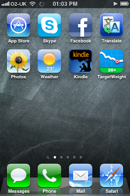
Yes, bright use of colors. I've only realized now that I do this quite often. During interim crit, I realized that I really remember things by colors. Hence how I organize my iPhone and iPad. People tend to get confused looking at them because I think people tend to categorize by themes? But this really works for me; I know which color each app has (a bit of a disaster when they suddenly decide to change its color).

Our tutor Paulus was saying, not particularly to me but in general, that it is much more effective if differentiation of sections were made by typographic detailing not just relying on the blunt uses of colors. That I completely agree.
My rationale behind use of colors and typefaces were that the writing seemed scary and I wanted to make it more friendly and approachable. So I think this particular idea has a point in using colors, but definitely Paulus' point was something to be noted. Especially for someone like me, who tend to be attracted to colors whenever there's a need for categorization.
上手く行けば、プロジェクトの最後には、大体もやもやとしていたことが、クリアになって意味が通じる。だから、プロジェクトについて話す時に、「これはこうこうといった動機で、こうこうというものを作りました」とシンプルにまとめることが出来る。
クライアントや、外の人に、自分のプロジェクトを説明する際には、そういう跡付けの合理化や正当化はかなり重要。簡単に説明できないとわかってもらえないから。
でも、実際のプロセスは、そんなクリアで合理的なものでは全然ない。笑。最後のアイディアに辿り着くまで、無駄なことをたくさんしている。そういうのって、他の人は知る必要はないと思うし、例え努力の結果だとしても、努力を感じさせないクールでスマートな完成品に辿り着く方がいいと思う。でも、大学はプロセスが大事、プロセスが大事、と言う。大学は学びの場だから、クールなプロダクトよりも、血と汗にじむ努力や試行錯誤の方に興味がある。というわけで、これからは出来る限りプロセスについても忘れないようにメモしていきたい。でも、プロセスについてまで書き始めると、キリがない・・・。