Saturday, December 31, 2011

Music, 2011


My personal best album from 2011:
1. The English Riviera, Metronomy
2. Suck it and See, Arctic Monkeys
3. Pala, Friendly Fires
4. On a Mission, Katy B
5. A Creature I Don't Know, Laura Marling
6. Mademoworld, Mademoiselle Yulia
7. In the Grace of Your Love, The Rapture
8. Eye Contact, Gang Gang Dance

Another amazing musical year. Particularly the success of female artists (Adele, Rihanna, Lady Gaga, Beyonce) was inspirational.

Although it was not released this year, if I were to name one album that I listened to more than any other this year, that would be this: Frank, by Amy Winehouse. RIP Amy.

In 2010, I went to 13 concerts, and this year I went only to 6. I'll name Laura Marling gig as the best one of those 6. One of my favorite songs by her is now remembered as a whistle song: 


2011 certainly was a turbulent year. 2001 was the year when I moved abroad for the first time, and that of course was also the year of 9/11. 10 years on and I would say 2011 was as dramatic, if not more, as 2001. Both in terms of international affairs and also for my personal life.

Arab spring, Japanese earthquake and nuclear crisis, countless protests, English riots, deaths of Bin Laden, Steve Jobs and Kim Jong Il... Trips to Indonesia, Hong Kong, Macau, Amsterdam, Berlin, along with various other places. Lots of group works, first time freelancing, D&AD award, and notorious dissertation... Visa process, first time living on my own, getting bank accounts, working at an advertising company, well, what else?
I am all calm right now but thinking back, what an intensive year that was!

I am scared for 2012, but I know next few months will be the best months of my life. God knows what happens after the graduation in July, but till then I will make the best out of it.


日本も、イギリスも、世界情勢も、私個人も、揺れ動かされた1年で、特に日本の方々にとっては、いろいろなことのあった1年だったかと思います。

そんな1年、私は、Metronomyの『English Riviera』と、Amy Winehouseの『Frank』を聴きながら過ごしました。この2枚は、アルバムと曲ごとの質感が好きで、ずっーと聴いていた。混沌とした世界情勢とはあまり関係なく、いままでと同じように、ダンスと脱力系の中間みたいな音を好んで聴いた1年。相変わらず、イギリスの音楽が多かった。でも、2011年個人的ベストアルバム3位までが皆男性アーティストというのは、個人的には珍しいと思う。クラブやコンサートにほとんど行かずに過ごした1年で、音楽シーンからは遠ざかっていたかも。

Thursday, December 29, 2011

Holiday

I used to think that I'd like to spend 11 months consecutively, to earn and spend 1 full month of a year on holiday. Recently I begun to think it may be as nice if I can be able to bring my work to my holiday locations; allowing me to work all year around but still being able to travel and see different things.

I came to think about this while I was in Japan. In previous visits to Japan have always been about meeting as many people as possible, seeing things, and going to places. This particular visit wasn't like that at all, as I pretty much spent most of my time staying in reading and studying.

In the book Nihon no Design (Design of Japan), Kenya Hara points out that as Asia gets wealthier, percentage of customers who will be using resort hotels will see increase in Asians. Asians don't tend to take as long holiday as Westerners. Different concepts are emerging with this shift.
Holidays don't have to be primary for an escapism. It can be a part of a working culture and it can perhaps be used to improve work motivation. Maybe I'm not looking all or nothing after all; half few hours under sunshine for one weekend may be all I need. I would love to spend half a day working, and another half by the beach even for a weekend.


10ヶ月死ぬほど働いて、残りの2ヶ月はヴァカンスで国外逃亡する・・・という生活を夢見ていたのだけれど、最近になって逆に、休暇先にも、仕事や勉強を持ち込んでもいいなと思えてきた。

今回の日本も、「さあ、人に会うぞ!遊ぶぞ!いろんなところに行くぞ!」というよりは、家にこもって本を読んでいたわけで。普段、自分がロンドンでしている勉強や仕事の7割くらいは、ネットさえあればどんな国でも、どんな場所でも出来ると思う。

原研哉さんが『日本のデザイン』の中で、インドネシアで進行中のプロジェクトで、「自然の中でリフレッシュしながら、ハイテク環境で仕事もできる」といったリゾート施設の話を書いていて。朝仕事して、昼は海で泳いで、夕方ビーチで昼寝して、夜またちょっと仕事して、寝る。そういうホリデーだと、魅力的だなあ。大学の友達と、ポルトガルかどこかのフラットで1〜2週間、観光やリゾートもぼちぼちしながら、みんなで一緒にデザインワークしたいなあ。


(Photos from Indonesia in April 2011)

Wednesday, December 28, 2011

Tokyo Diary

Survived Boxing Day tube strike and am back in London! Big thank you goes to Megumi for organizing a lovely ISA reunion, Maiko-san and Miki for inviting me to various parties and introducing Tokyo creatives to me. Here goes my little summary of my two weeks in Tokyo!


Ed (of CSM fashion) was in town. We had ramen noodle, then had drinks at a pub in Shinjuku; observing Japanese people together.


Toyo Ito's architecture school. Loved the curtain. The place was very close from Tokyo Tower.
伊東豊雄建築塾。工事中?で網ネットで建物が覆われていたのだけれど、それが逆に、カーテンと組み合わさり、面白い模様を作っていた。


Architectural model made by lower school kids. Impressive.
小学生の建築の模型。うまい。わたしも参加したい・・・。


Faces of Japan.


Ex-Apple store assistant helping newbie iPhone user, before our amazing reunion with a big group. Us three went to Kazuki (of ISA)'s theater together and that too was one of my highlights of this trip.
アムステルダム時代の日本人で同窓会に参加。6年くらい会ってない子もいたのだけれど、みんなまったく昔と変わらず。外見や性格も変わらないし、お互いに対する態度も変わらないし。「昔のまま、大人になった」というよりも、むしろ「昔そのまま」だった。
そのうちのひとりが、オランダ時代からずっとお芝居をやっていて、彼の日本での芝居も今回、運良く観に行けた。劇自体も面白かったけれど、彼が昔と変わらず頑張っていることが見れたこともとても嬉しかった。


Tokyo was super sunny, never rained. Super cold too as the temperature dropped colder than was in London. Though it was nice to feel strong beams of sunlight even in a winter.
10年ぶりの日本の冬は、意外と寒かった・・・。


Streets of Tokyo is simply wonderful. I cannot stop finding everything so amusing. In another words, bad graphic design and bad naming everywhere.


A scene from a party that was held in the office of a design studio and an architecture studio. Full of interesting people and delicious food! I have learnt to exchange business cards when I'm introducing myself. Though exchanging business cards turned out to be quite an useful ritual.
日本のパーティーも、欧米のパーティーと似ていた!友達が友達を呼んで、面白い人が集まって、知らない人同士が繋がって・・・。割と人見知りなのに、このパーティーはとても楽しかった(マイコさん、ありがとう)。

Thursday, December 22, 2011

From Text to Book WIP and Final Crit

Idea 1
Things I've changed since the first version: different the typeface of the main text, created covers for each sections, had an idea of moving the table of contents for the case and having general principle as a separate chapter, fatter dimension of the book (the height is now a bit shorter than A5), each section having different width so that the titles can be seen when slipped into the case, and paper and colors have been picked.

One of the hardest parts was to select the colors and create a smooth gradient. I've collected different shades of yellow from different paper shops and that ended up as a bit of a nightmare to organize. Here are some of my tests:
At the crit people suggested me it would have made more sense to have 1 in between 3 and 4. I think it's necessary to find a paper stock that stocks different shades of colors to match the hue and really to create a better gradient.

Here is the completed version with the case and all the booklets:


Idea 2
The following image is some of the development of the design. It is hard to see from the photo but they are the tests with different stocks of paper.  At the end, I went for the yellow-shade heavy stock paper as it gave formality ans seriousness to the impression. I chose serif typeface, because I wanted it to have formal feel to it as the writing itself had formal and somewhat authoritarian impression, demanding the readers to follow the rules. This writing sounds formal like telling you ultimate rules (hence the serif type and heavy stock paper) but actually that is not the case as different books do things differently (which can be realized when using those bookmarks in different books).

The design considered how the bookmark looks when the book is being closed, as well as when it is being in used:

The disadvantage of using heavy stock paper is that it is simply too thick to put all the bookmarks in a single book. Bookmarks ended up being fatter than a small paperback book:

These images bellow shows the bookmarks being in use. The reader can see the actual page that the text is referring to, while reading the text. It provides an example of an execution by putting things into context. At the same time comparing different books allow the reader to see that there is no one ultimate way.
It turned out to be idea 1 and idea 2 became two almost very opposite ideas. Idea 1 is all about usability and idea 2 is more of a study of different books. I think at current stage, I still thought about usability of idea 2, making it sort of usable, but I think it would be a way more interesting if I can ditch the usability of idea 2 and really focus on "how to show that different books write and present information differently, and there is no ultimate rule to it".
Some ideas I have received at the final crit was to use a linear color gradient for the color of paper and seeing how the gradient would be disordered for different books.


Final Crit
Some of the photos taken at the final crit. The ones here are some interesting ones in terms of scale and forms, but there were many other great executions. I particularly loved Gabriel's piece (which I didn't take any photo).


本を作る時に、エディターや、デザイナーが知らなくてはいけない、文章や校正についてのルールの文章。その文章を使って、本をデザインするプロジェクト。
アイディア1は、難しくてわかりにくい文章を、なるべく楽しく、アクセスしやすいヴィジュアルとして見せるか、というユーザーの視点に立ったデザイン。アイディア2は、まったく同じ文章なのだけれど、あえてその難しい文章を、そのまま「正装」させたデザイン。ただ、こちらはブックマークとして使えるようになっていて、実際の本が一体どのようにルールに従っているかがわかる仕掛け。文章だけ読んでもわかりにくいので、横に実物の本を見ながらやればわかりやすいかな、という発想がきっかけとなったデザイン。ただ、それを通じてわかるのは、一応これはルールについての文章だけれど、本によってアプローチの仕方はまったく異なっているし、「絶対のルール」なんてものはないのだということ。現存の本の多様性が、ブックマークをするという行為を通じてわかるようになる。

Thursday, December 15, 2011

I, Amsterdam


Although I go back to Amsterdam at least every once a year, my last visit to Amsterdam taught me in particular about the origin of my visual preferences. It's always a great discovery to be able to make sense of yourself. It became clearer than ever that things I do are heavily influenced by the design-scape (graphic, architecture, typography, product) of Holland. Such influences are not so much of a conceptual one, but rather stylistically. I see design in Amsterdam, and they resembled myself.


I think I can be, and I also tend to be, quite critical of Japan and London, but being critical towards Amsterdam or Holland is a harder task for me. It's quite interesting to think why that's actually the case.


Wednesday, December 14, 2011

You Stay Who You Were

I'm in Japan at the moment, where I currently am opening boxes that we left behind 10 years ago. It's like opening a time capsule, it's utterly exciting! Boxes come with my artistic work from very early age. It's crazy how I haven't changed since.
I love minimalism but I also love maximalism. I seriously love colors. Such of my tendency makes me desperately want to visit countries with colorful cityscapes; such as Morocco, Mexico, and Brazil. I am dying to pay visits those three places, but that's another story.

Taking the topic back, followings are some of my drawings I just dug out. Thanks mom and dad for keeping them too!


I can clearly tell that is me on the left and yes I still wear blue mascara. Not much lately but in my teen years, I was obsessed with vivid pink. It seems like that obsession may have started much earlier.


The color palettes from images above are identical to the Hermes scarf that I bought recently. See, I haven't changed.

Tuesday, December 13, 2011

Blog Makeover

So, as you can see my blog got a new look! Whatcha think? One column layout grid inspired heavily by amazing Shini Park's Park & Cube blog.
One column may be a little controversial as you need to scroll all the way down to reach to the navigation bit, but I really wanted the emphasis to go on the visuals. I've reduced the number of posts per page, and I hope that helps a bit.
This layout is made to work well on iPads, and also I've started using different layout for mobile devices.

With interfaces and such, I like keeping things minimal and stay with monotones to go with any color that images in my posts may have. Though, orange is definitely trending inside me lately and I thought it may be nice for a change. What can I say, my inner Dutchman is calling.  I've also realized afterwards that the use of orange works with Blogger logo and Blogger interface (which only I would really see but it's still nice).
Plus, apparently Pantone 17-1463 Tangerine Tango is the color of 2012.


I seemed to be shopping for orange lately too. Expect me to wear that Peter Jensen orange sweater everywhere.


I am dying to re-design my website and also I would like to have a place where I can keep the photos that I take. I am very much liking Facehunter Yvan Rodic's Visual Diary site for an inspiration of that.

From Text to Book WIP (part.2)

Idea no.2
The writing was confusing just on their own and I thought it would be a good idea to read the text while looking at an example of actual book. This idea is separating writing into loose paper, inserting them into an actual book, to provide an reference of the text in order to enhance the reading experience of this confusing text.
I personally thought this was a weaker idea, as it seemed like I would be treating the book of my choice as a perfect example. However, at the interim-crit, I've presented both ideas and through feedbacks I've realized it would be interesting to create bookmarks, that allow readers to compare and contrast how different books can have different ways of displaying information. This text sound like a rule book, where things must be kept in a certain way, but that is actually not the case and different writers and publishers all practice in different ways. The idea of creating bookmarks can possibly highlight this point.

Above images are a study of how different sections could be fit into a single book. I've inserted the relevant texts in relevant pages of the book.
I've found out that some sections can belong in multiple locations, after inserting the text it is difficult to navigate text to relevant places, and the left over text suggest that books don't contain all the things that were talked about in the text.
The last image shows the leftover texts that this particular book did not contain.

Friday, December 2, 2011

From Text to Book WIP

I am pretty good at post-rationalizing. I genuinely believe that things become clear and everything makes sense at the end of a project and if it doesn't, it means I haven't thought-through enough. Well, sort of. I guess not everything works that way, but my most successful projects were the ones that I felt that different thinking and concepts came together in a clear way at the end.

My blog has been a place for this amazing post-rationalism, where everything here seem to have clear ideas and makes total sense, but obviously that's not the process that I've gone through. It's quite difficult to be blogging while you are doing a project, mostly due to a lack of time, but I'll try and record my process from now on.


We all were given texts about reference of stylistic information on what to include in a book, aimed for designers, writers, editors, and publisher. The text contained full of mistakes, our first task was to correct them.
It's a very useful and practical piece of writing, but it sounds/looks too scary and feels quite authoritarian.

Idea no.1
To make it more practical, I've divided the sections into different books. When you are writing parts, you probably know which section you are working on. You only need the writing about the part that you are currently working on, not the entire book. Everything is contained in a box with general principle, and idea is you just pull out the section that you need, and that sits small and nicely on your desk.


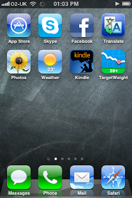
Yes, bright use of colors. I've only realized now that I do this quite often. During interim crit, I realized that I really remember things by colors. Hence how I organize my iPhone and iPad. People tend to get confused looking at them because I think people tend to categorize by themes? But this really works for me; I know which color each app has (a bit of a disaster when they suddenly decide to change its color).


Our tutor Paulus was saying, not particularly to me but in general, that it is much more effective if differentiation of sections were made by typographic detailing not just relying on the blunt uses of colors. That I completely agree.
My rationale behind use of colors and typefaces were that the writing seemed scary and I wanted to make it more friendly and approachable. So I think this particular idea has a point in using colors, but definitely Paulus' point was something to be noted. Especially for someone like me, who tend to be attracted to colors whenever there's a need for categorization.


上手く行けば、プロジェクトの最後には、大体もやもやとしていたことが、クリアになって意味が通じる。だから、プロジェクトについて話す時に、「これはこうこうといった動機で、こうこうというものを作りました」とシンプルにまとめることが出来る。
クライアントや、外の人に、自分のプロジェクトを説明する際には、そういう跡付けの合理化や正当化はかなり重要。簡単に説明できないとわかってもらえないから。

でも、実際のプロセスは、そんなクリアで合理的なものでは全然ない。笑。最後のアイディアに辿り着くまで、無駄なことをたくさんしている。そういうのって、他の人は知る必要はないと思うし、例え努力の結果だとしても、努力を感じさせないクールでスマートな完成品に辿り着く方がいいと思う。でも、大学はプロセスが大事、プロセスが大事、と言う。大学は学びの場だから、クールなプロダクトよりも、血と汗にじむ努力や試行錯誤の方に興味がある。というわけで、これからは出来る限りプロセスについても忘れないようにメモしていきたい。でも、プロセスについてまで書き始めると、キリがない・・・。